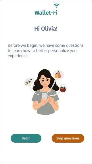
Wallet-Fi App
UX Design Case Study
A digital wallet app simplifying your financial tasks on the go.

Project details
My role: Product Designer
Type of Design: A digital wallet for mobile purposes.
Objective: People are juggling multiple apps for different purposes. We need one app that meets the core functions of a digital wallet to help organize finances. There’s many wallet apps that serve similar functions, but what are people desiring in one digital wallet that can serve a real need and what are those needs?
Navigate to the sections or scroll for the process
Duration: 2 months
Tools: Figma, UserTesting
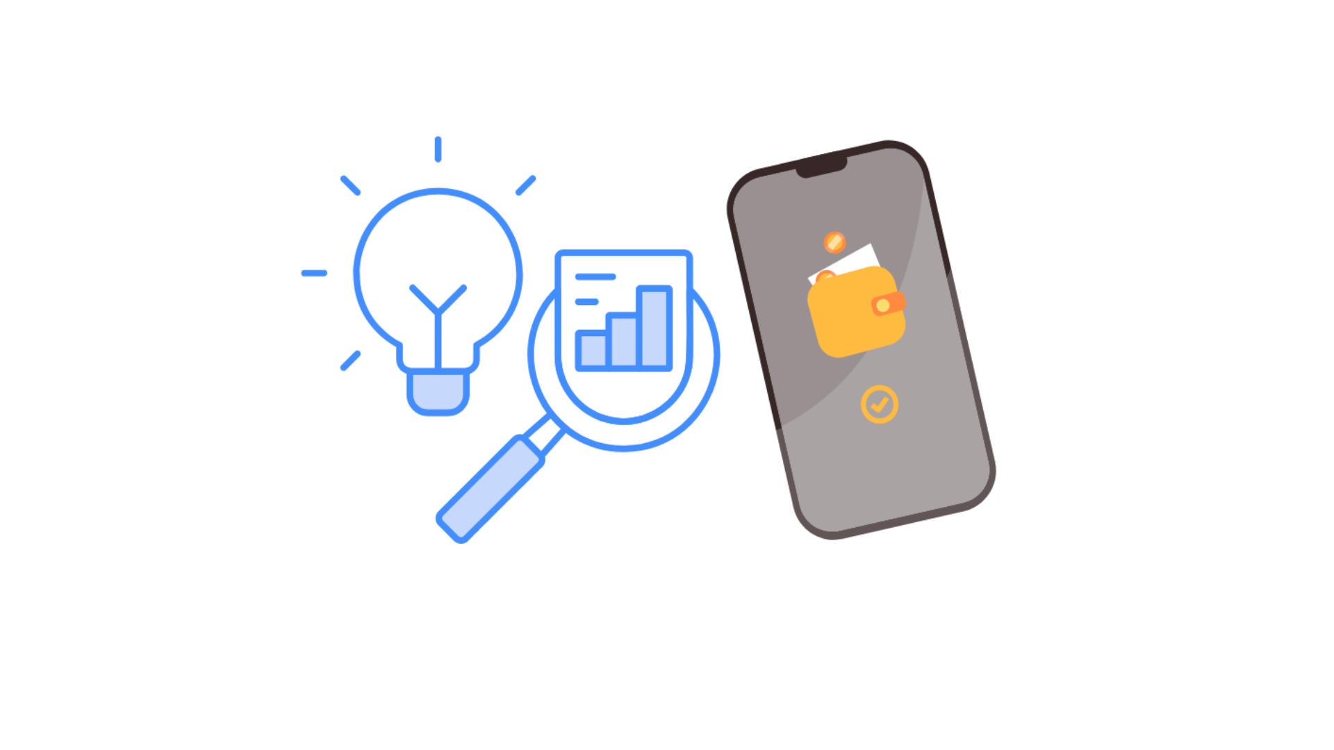
The Problem
Digital wallet users are juggling between different apps to complete basic financially-related tasks. There’s not a digital wallet that meets people’s purposes for simplified tasks, including sending and receiving money, paying on the go and tips and insights around spending habits for improved budgeting.
Opportunity: How can I improve this experience for people?
Competitive analysis
Strengths
Sleek, simple design
Easy set-up for Apple iPhone users
Customer security and privacy using biometric features
Easy to make payments
Opportunities
Tracking payments and categorical spending insights
Rewards programs through incentivizing people to use digital wallet
Split bill features
Renaming cards to easily identify them while on the go
Strengths
Centralized storage for different cards
Available globally
Syncs across your devices
Efficient payment process
Strong brand identity
Opportunities
No budgeting feature
Spending history insights
Stronger security measures
Sorting feature across spending categories
Weaknesses
Must be Apple iOS users
Peer-to-peer payments available through Apple cash but takes additional steps
No extensive purchase history or insights on spending
Not widely available in other countries or have limited features
Threats
Saturated market of competitors
Easier options for people to send/receive money
Google wallet has more features integrated through their suite of services
Weaknesses
Available to Samsung mobile users
No unlock needed for small payments
Data privacy concerns
Slow user base
Threats
Apple pay has a loyal customer base
Security concerns
Surveys
I first administered surveys to help me prioritize themes to focus in on during interviews and help give shape to opportunities I could address in my own mobile app. The following are some quotes from participants expressing needs where I expanded upon in my interviews.
“I feel like that’s the wish list that I would have to make sure that peer to peer transfer is as painless as possible.”
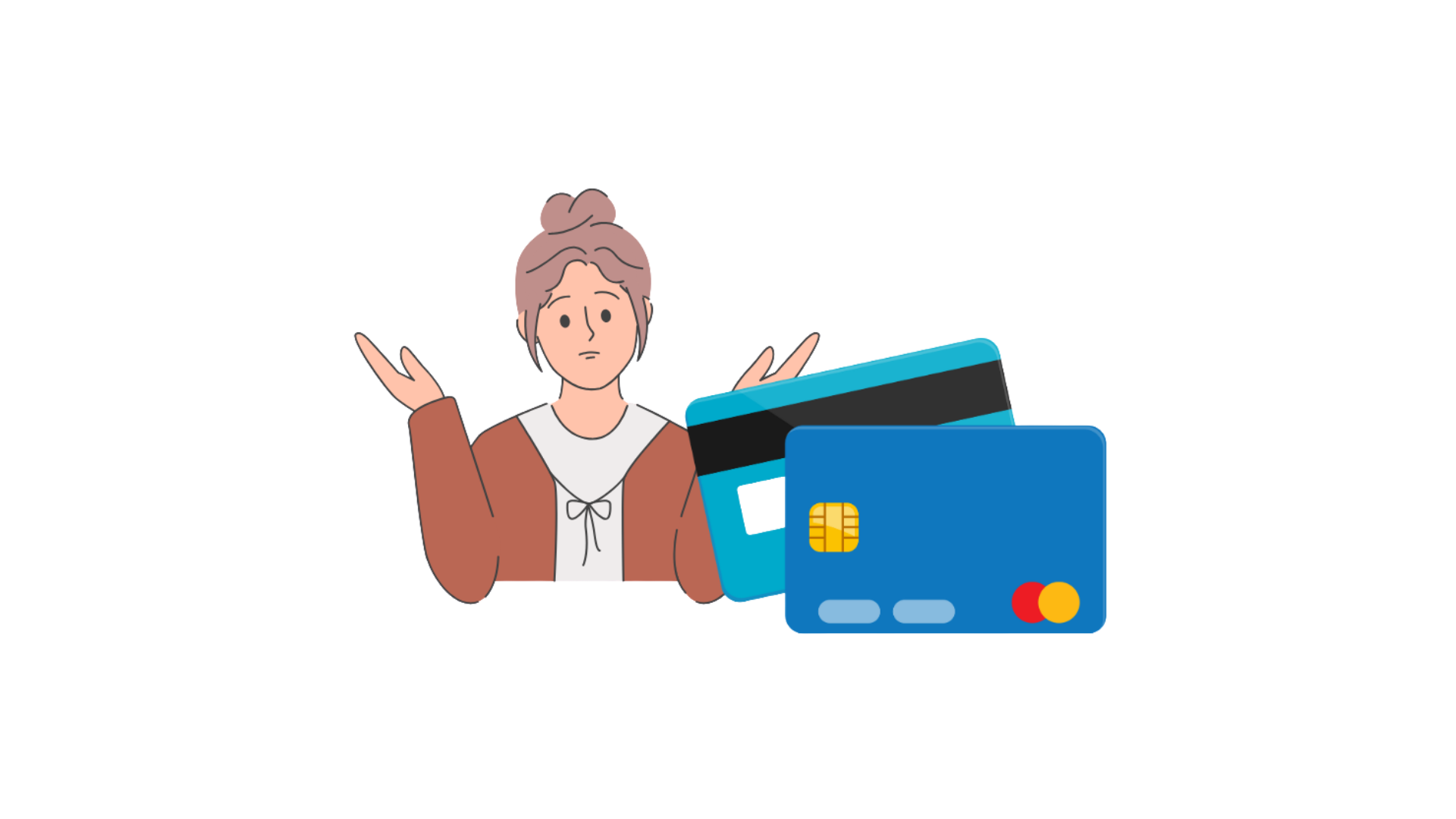
“Sometimes I’m concerned about the security risks involved with linking bank accounts and cards to a digital wallet.”
“So like having a detailed transaction history that I can view at a high level or filtering or date ranges, things that are just very easily accessible. Those are valuable to me.”
“You have to use something else or because there’s like multiple cards in my wallet, sometime I select the wrong one because I was doing it too quickly.”
User interviews
I then conducted interviews to expand upon recurring themes from the surveys, which helped me prioritize certain features for Wallet-Fi. I applied affinity mapping to analyze and synthesize my insights in Figma.
Core user needs based on initial survey research: trust and security, organization, convenience
The following core needs are gleaned from the user interviews which helped me prioritize features and opportunities in my digital wallet app.

For iOS users, the option to use Apple Wallet is already available on their phones.
No. 1 - Convenience
The use of different apps for financial tasks are context dependent, but the choice to use an app is what is most convenient for people (ex. already downloaded on their phone and/or connected to their bank).

No.3 - Trust and credibility
People expressed their need around making sure their digital wallet was credible, established and mitigate any trust and security concerns.
No. 2 - Easily identifying the right card
People need the ability to identify the right card quickly to prevent payments going on the wrong card.
No. 4 - Budgeting features
Most digital wallets lack a budgeting feature; most times there's budgeting apps that only serve that purpose. There lacks a comprehensive feature where it includes a deep dive around your spending to generate insights in order to track expenses and enable you to budget better.
User Personas
Who are we designing for?
I generated personas conceptualized from the user insights from the interviews and surveys. This helps reorient me with people's needs, goals and frustrations before designing. Meet Clarissa and Marcus!
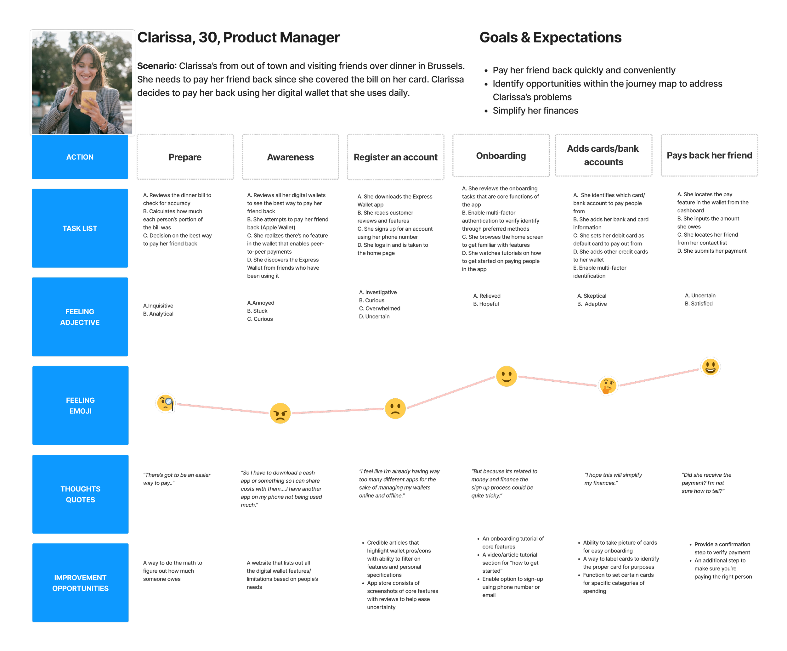
Clarissa's my primary persona and she represents people who are often on the go, tech-savvy and juggling many apps just for paying back friends due to the limitation of features depending on location.
She has global friends all over that she travels to and is currently using many digital wallet apps because the availability of mobile apps is limited depending on the region. Often she switches between cards so needs a way to quickly identify the right card when on the go.
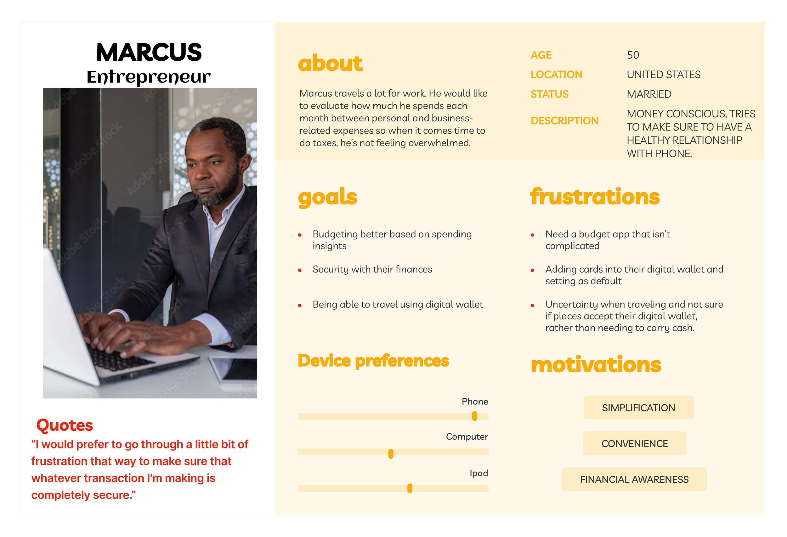
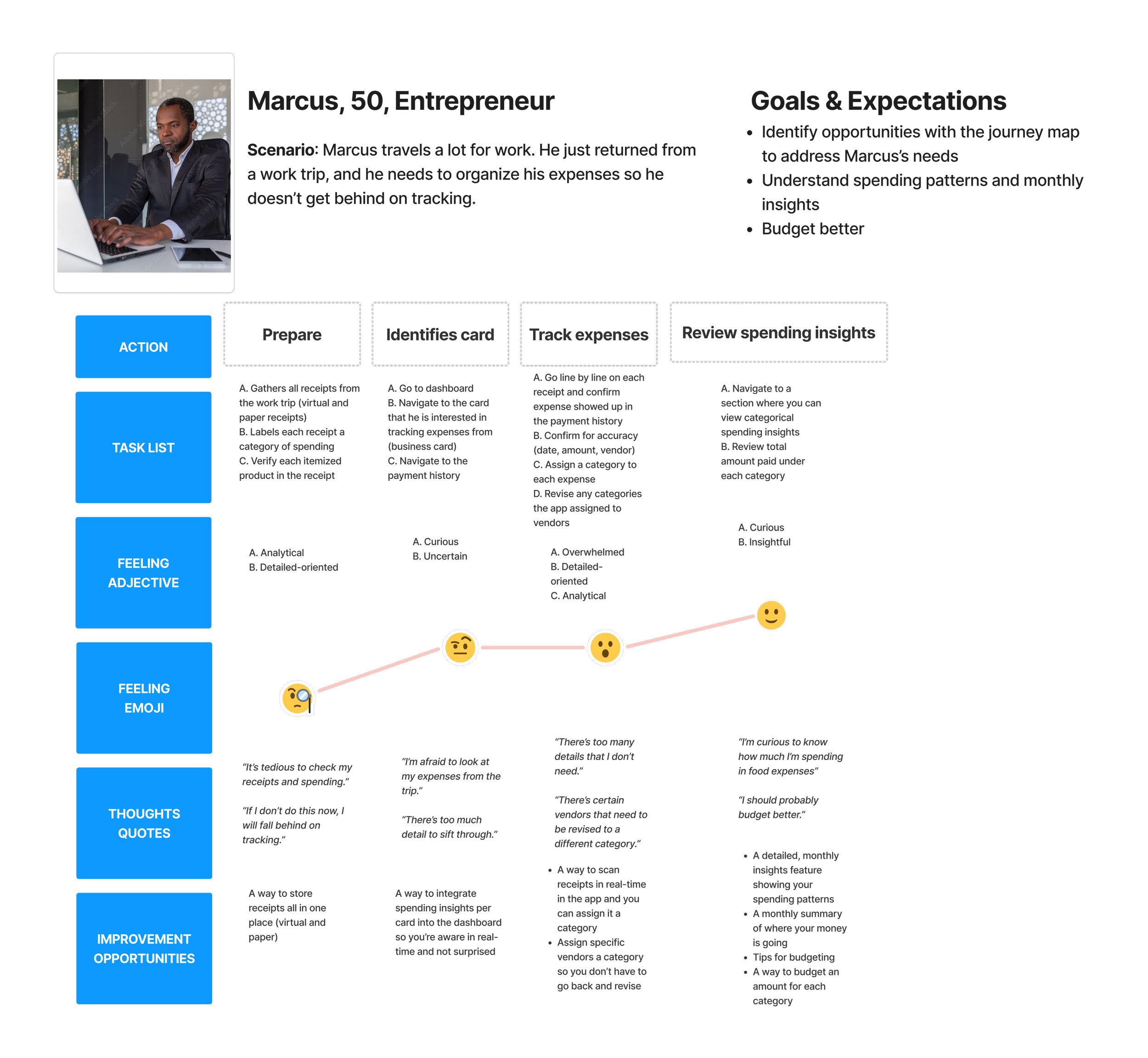
As a self-made entrepreneur, Marcus travels a lot for business and needs a system in place to monitor his spending between personal and business expenses.

Journey maps
To help reorient myself with user's goals and needs, I created journey maps to help empathize and conceptualize the touchpoints of the user's journey. The touchpoints include understanding the action, tasks, feelings, emotions and opportunities to improve the overall experience.
Clarissa is a tech-savvy person who uses her phone for most purposes. She wants to conveniently pay back her friend using one digital wallet so her finances are simplified in one place. She also needs a way to identify the accurate card when on the go.
Marcus travels for work a lot. I want to track my expenses easily between personal and businesses so I'm informed on how much I'm spending monthly.
Ideation phase
I started out by sketching using pen and paper and migrated to wireframe components created in Figma for some mid-fidelity sketches.
The questions I asked myself during this stage:
1) What goals do I want to accomplish during the onboarding process? How can I personalize the experience for people?
2) How can I instill trust in the process when handling people's money?
3) How can users identify the right card while on the go?
Mid-fid wireframes
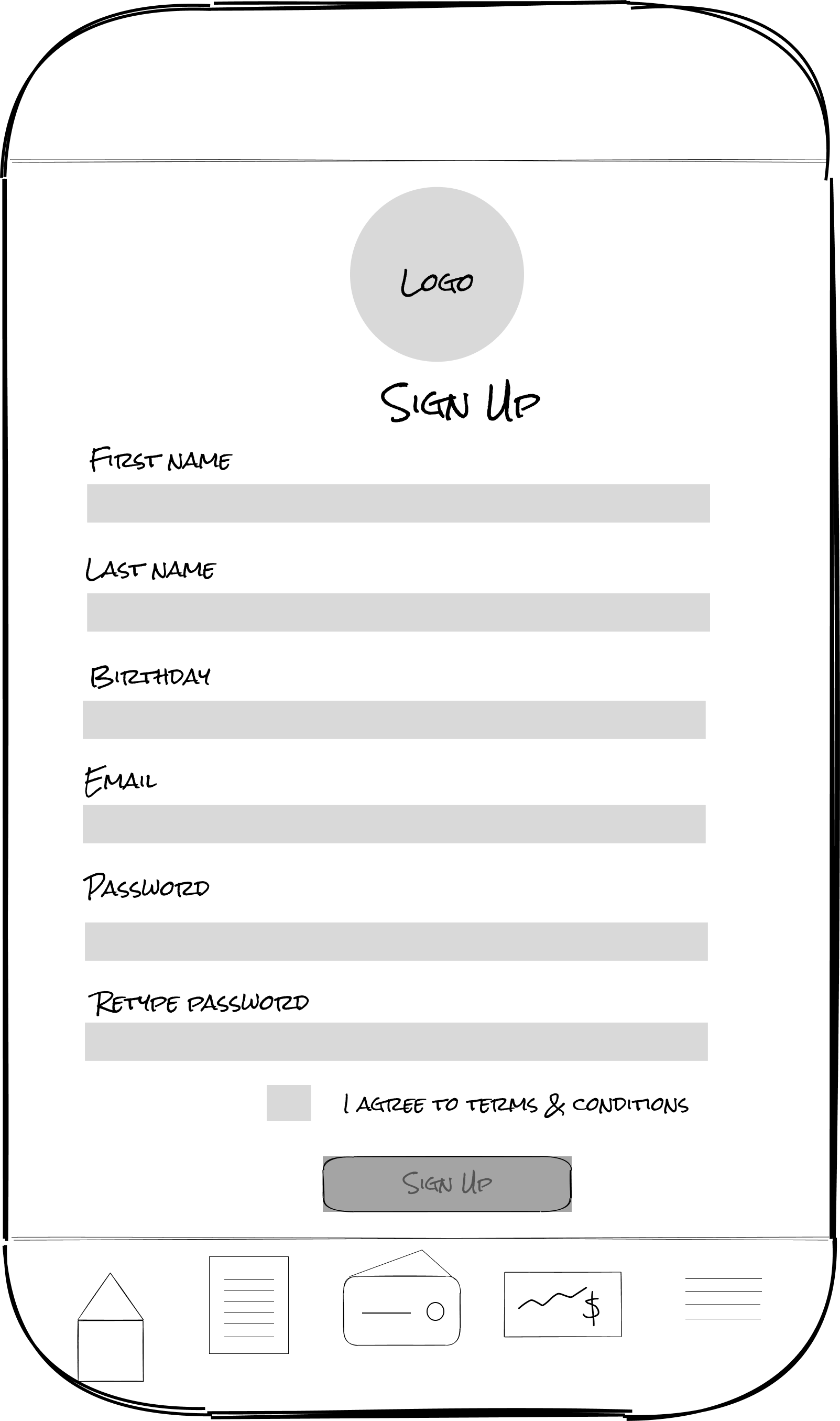
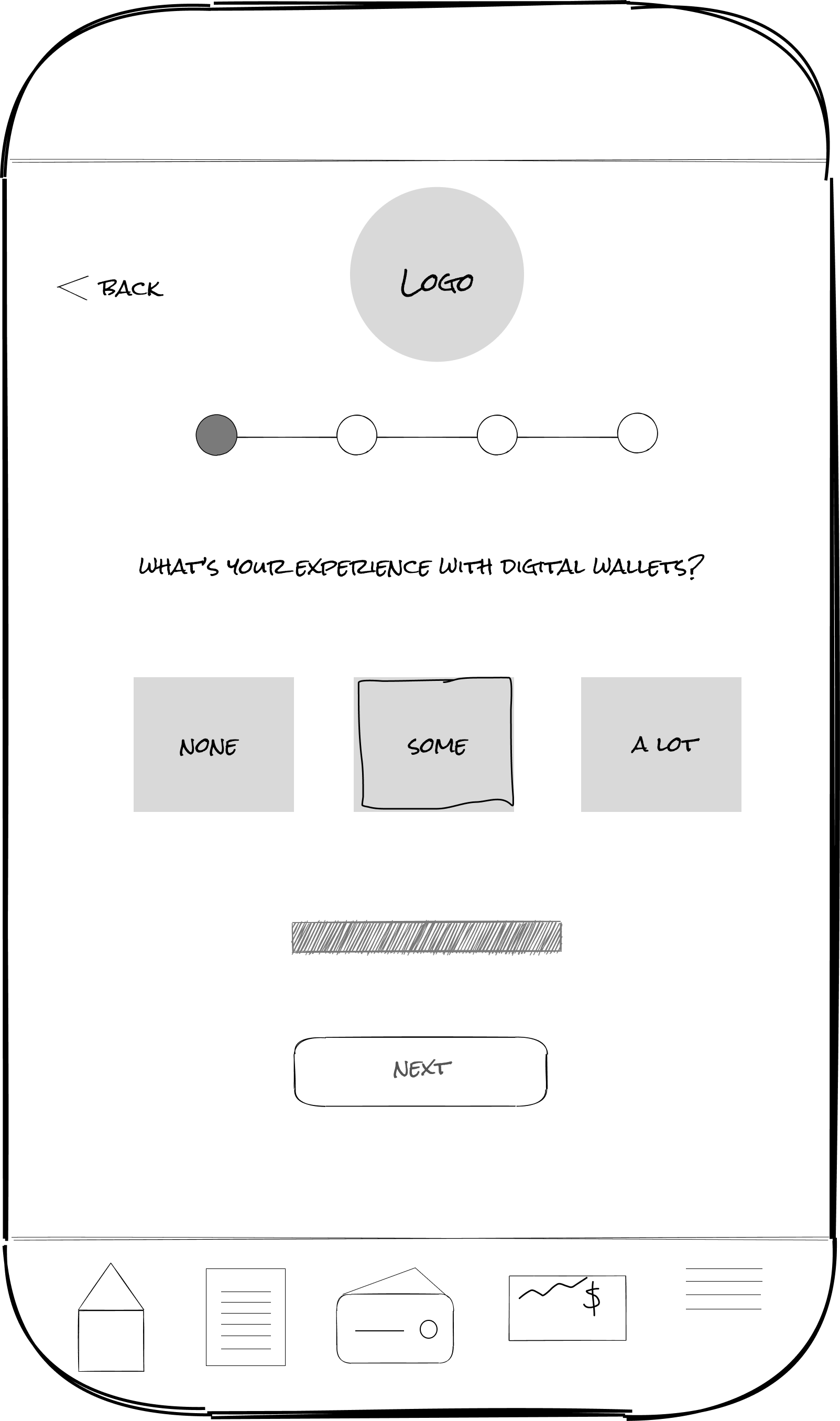
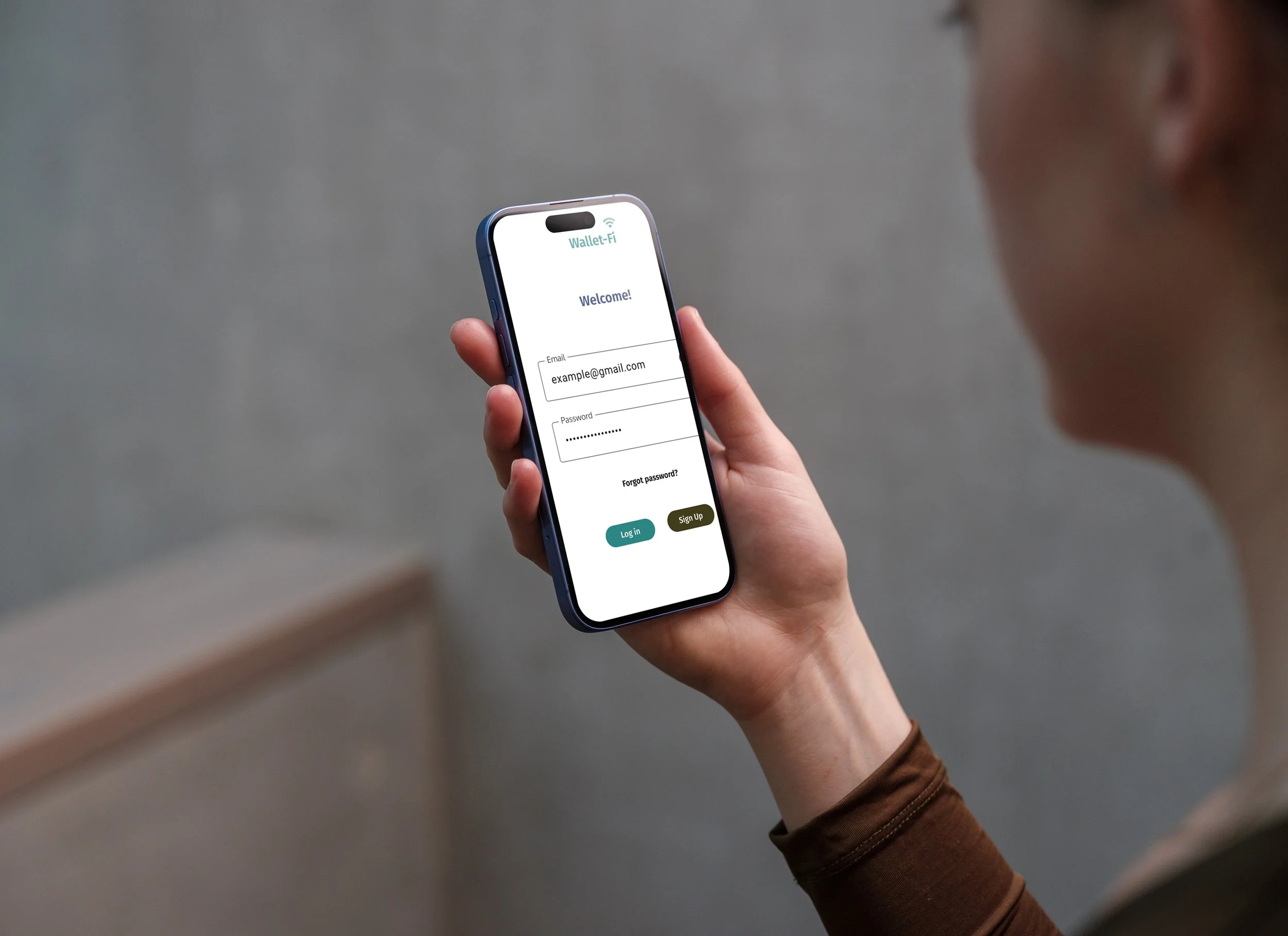
Feature 1: Login/Setup and onboarding
User story 1: As a new digital wallet user, I want to create an account using my email, so I can easily login to my account.
-Login
-Sign up
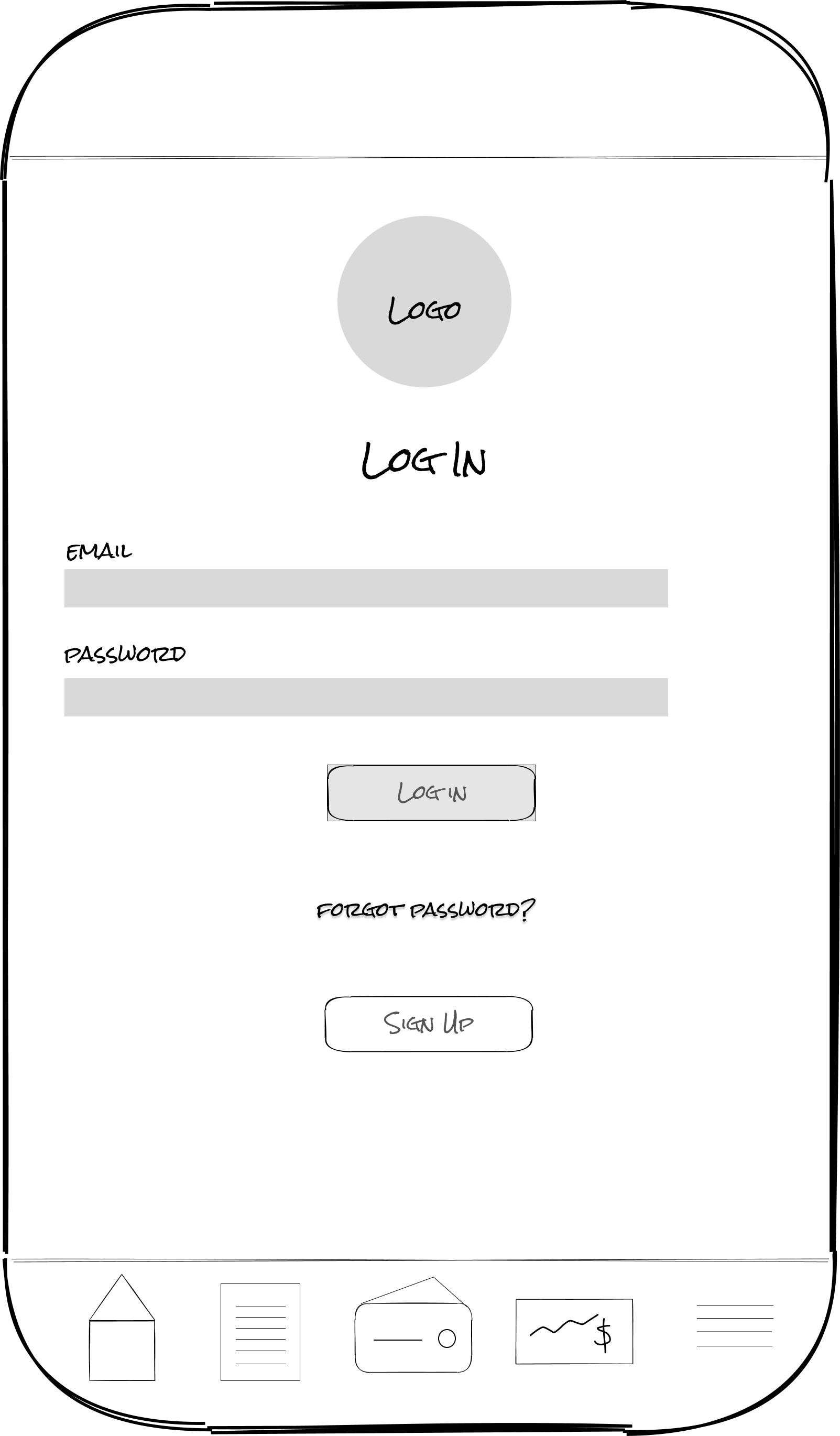
Sign up
Onboarding
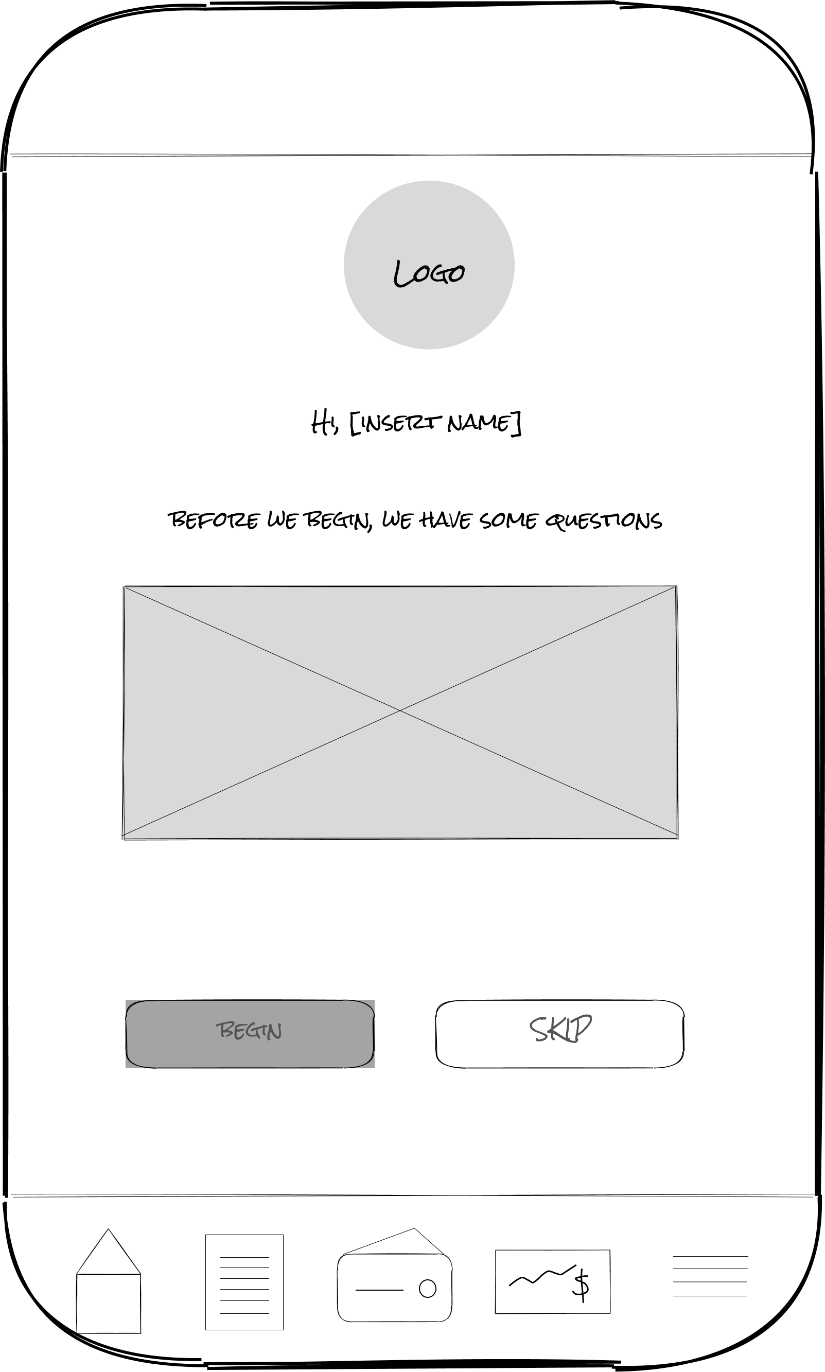
Survey begins
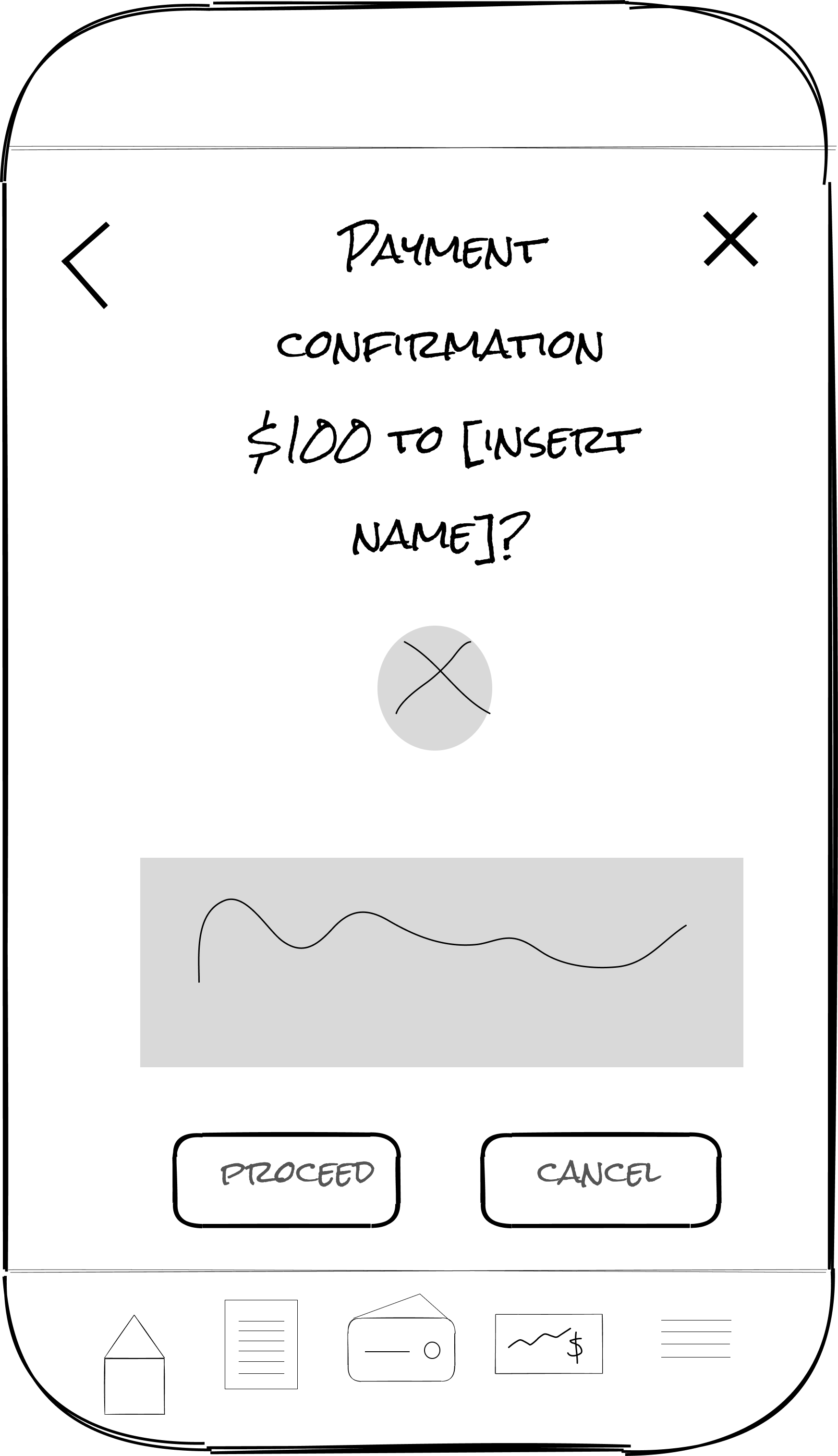
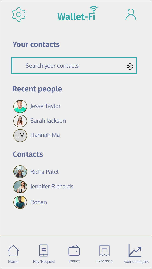
Feature 2: Send and receive money
User story 1: As a returning user, I want the option to send money to others from the dashboard so I can be sure people are getting paid conveniently.
User story 2: As a returning user, I want to be able to request money from people from the dashboard so I can make timely payment for bills.
Searching contacts
Input amount
Payment confirmation


Usability testing
I conducted usability tests with people that fit my user background (tech savvy, phone dependent) to evaluate usability and user satisfaction. These tests prioritized critical areas of improvement for me, highlighting the following feedback.
I originally didn’t have a pay/request icon in the nav bar and instead it was nested as a function in the wallet icon. Since it’s a critical goal for users, I decided to explicitly include it in the nav bar.
Color contrast check to make sure my
my forehand and background colors achieved web accessibility standards.
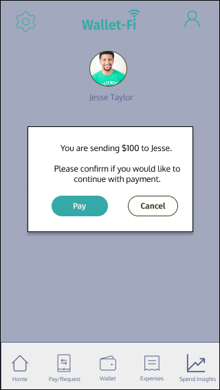
I initially had a separate screen dedicated to payment confirmation, but I decided on a pop-up overlay message to reinforce it’s a secondary action that fits in the overall user flow of sending money.
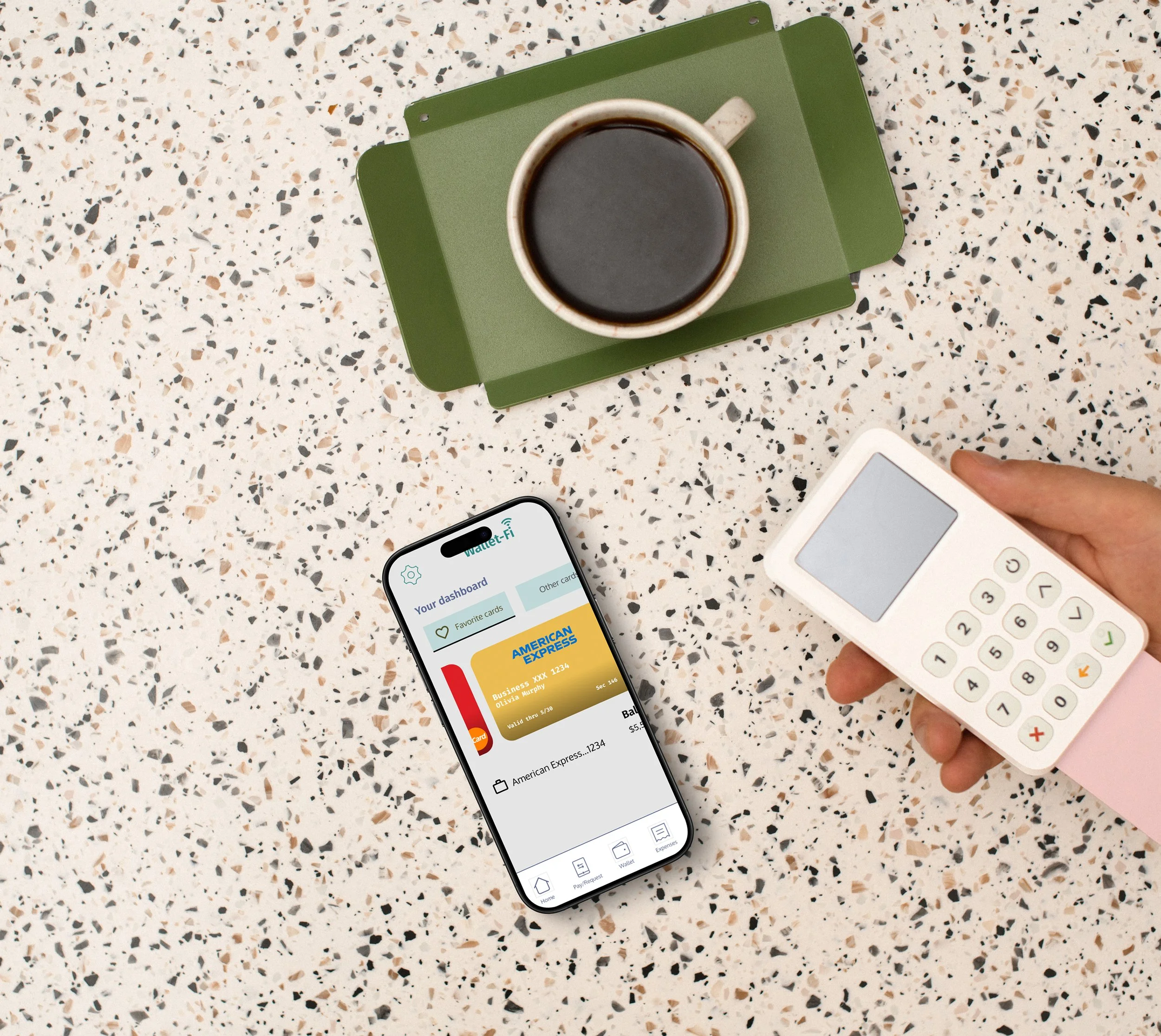
This is the dashboard view where you can access/view your default card and others, see expenses and add additional cards. I made adjustments to the following areas based on usability tests findings.


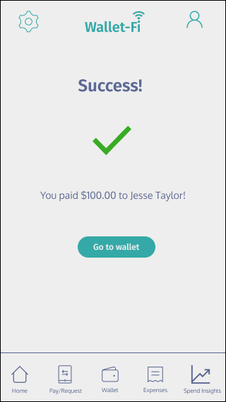
First iterations did not include visual indicators for successfully sending money. Some participants stated how adding a visual illustration with a green check would convey a stronger message and I agree!
People stated they expected a visual indicator/illustration after their card was added to wallet.
Click to view the interactive prototype
Mockups


Challenges and Reflections
The challenging part of my project was making sure my foreground and background colors complied with web accessibility standards so in midway through the project I changed my colors to make them accessible. I should have ensured stronger security measures or trustworthy language throughout the app especially since it’s handling people’s money.