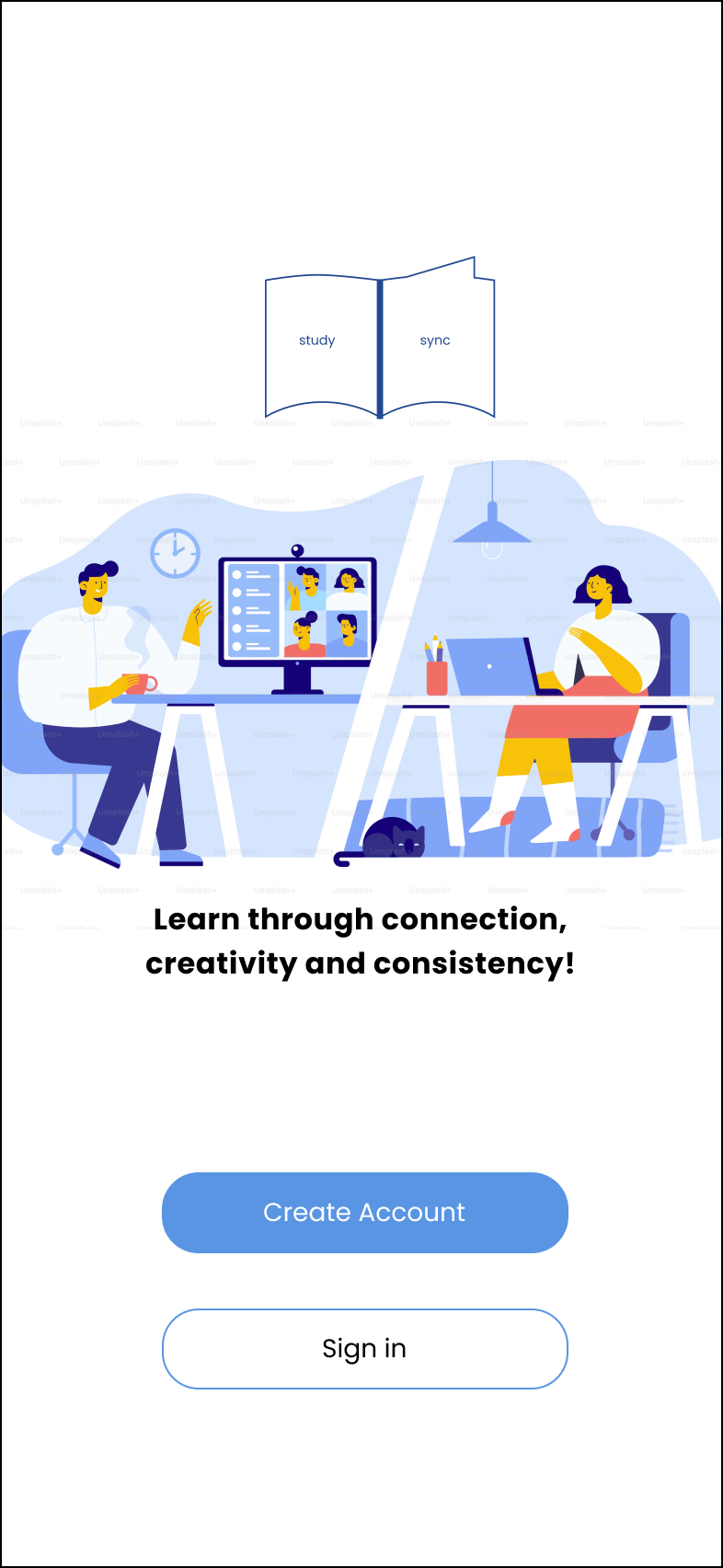
Study Sync App
UI Case Study
Dedicated for learners in need of connection, motivation and accountability. Learning doesn’t have to be done in isolation!
Project details
My role: Product Designer
Type of Design: Responsive web app for a study app.
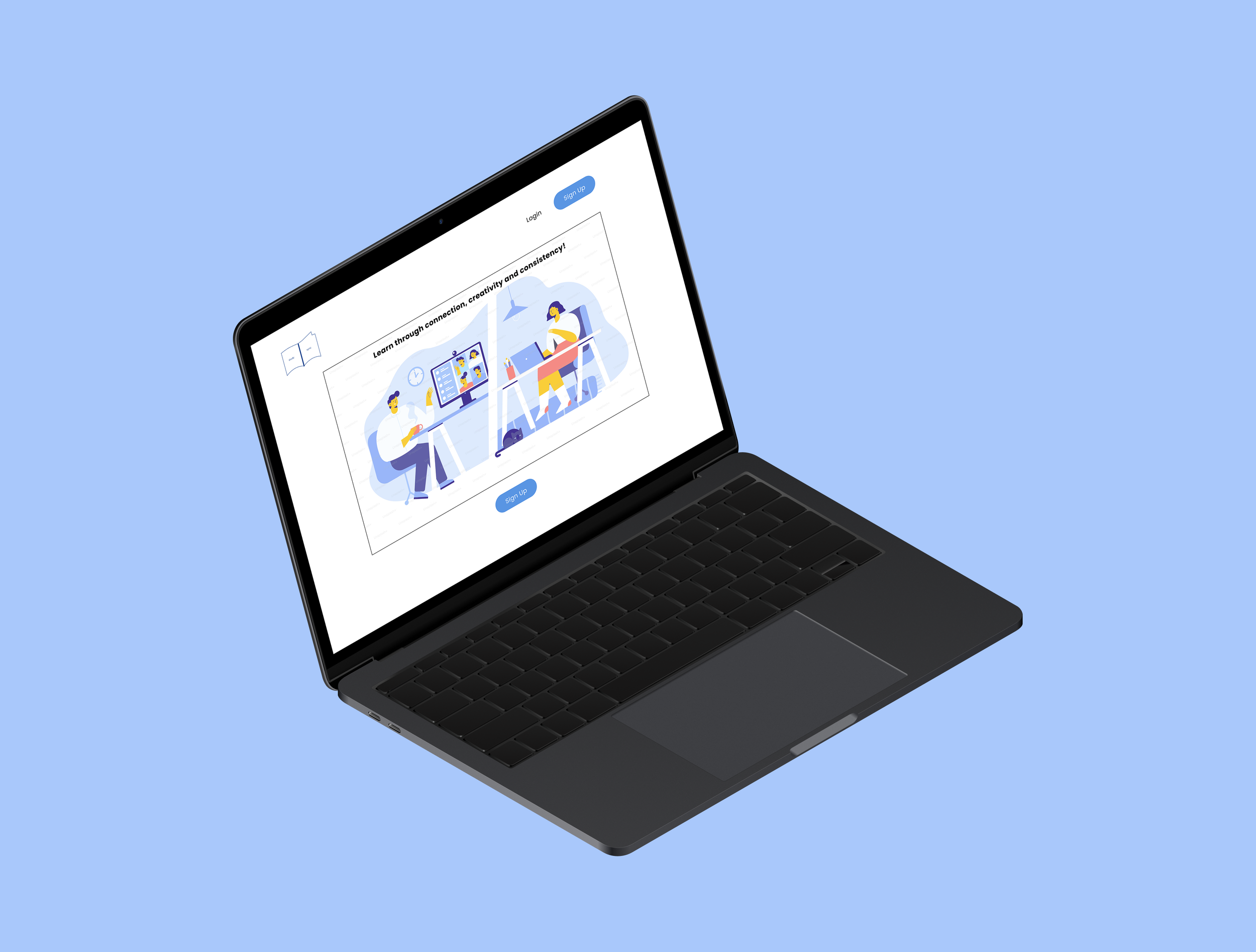
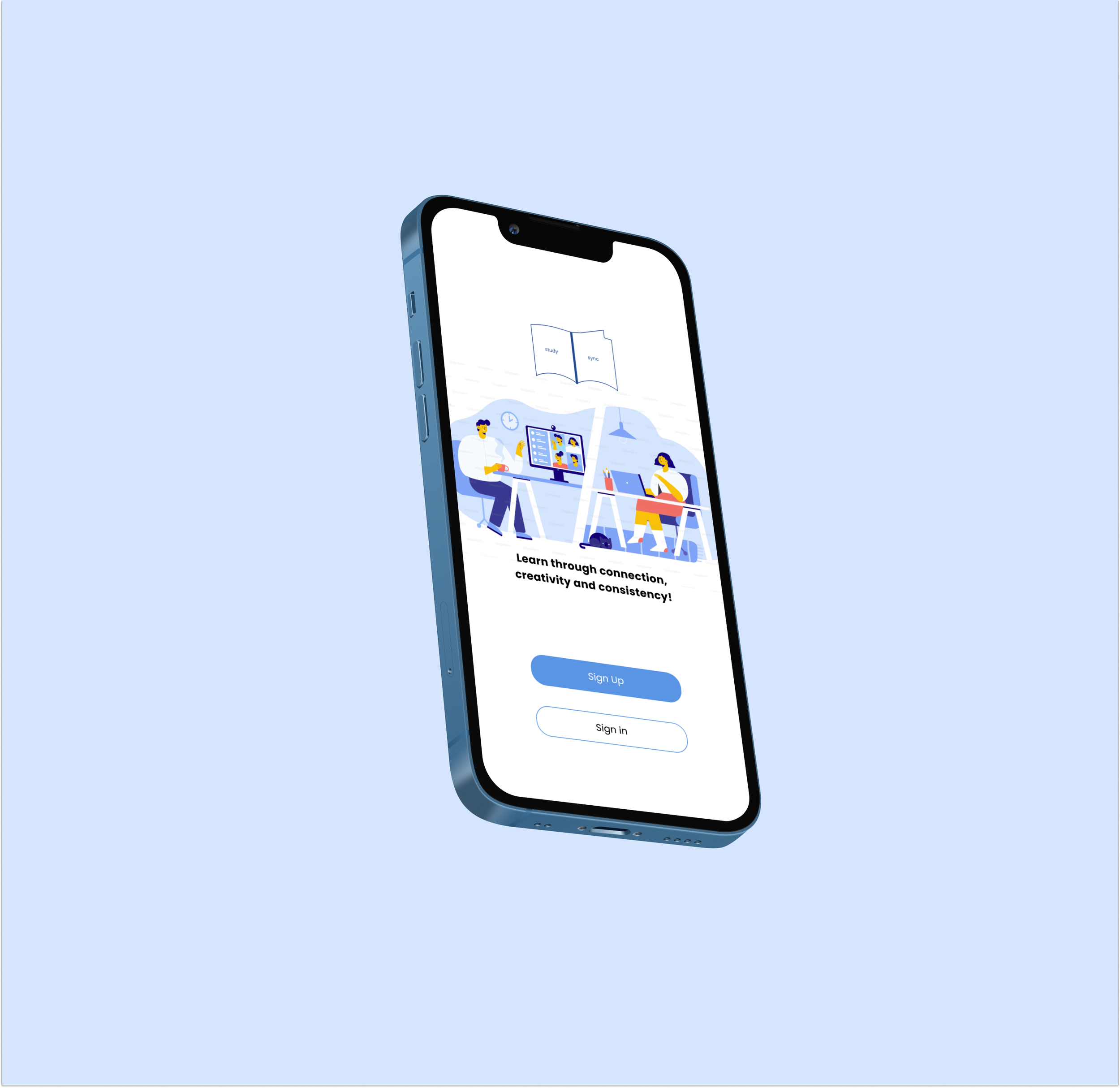
Purpose (context): The Study Sync app was designed to connect virtual learners in their studies since it can feel isolating when learning by yourself. We aim to create a space where students feel motivated to learn and stay engaged in their subject by providing opportunities to connect and make learning fun collectively. This will be a responsive web app where people can interact on whichever device suits them as they juggle school, work and personal obligations.
This is a personal project and part of CareerFoundry’s certification in Product Design - UI specialization section. This study app was personal to me as I was learning virtually and can feel isolated or disengaged occasionally without peers.
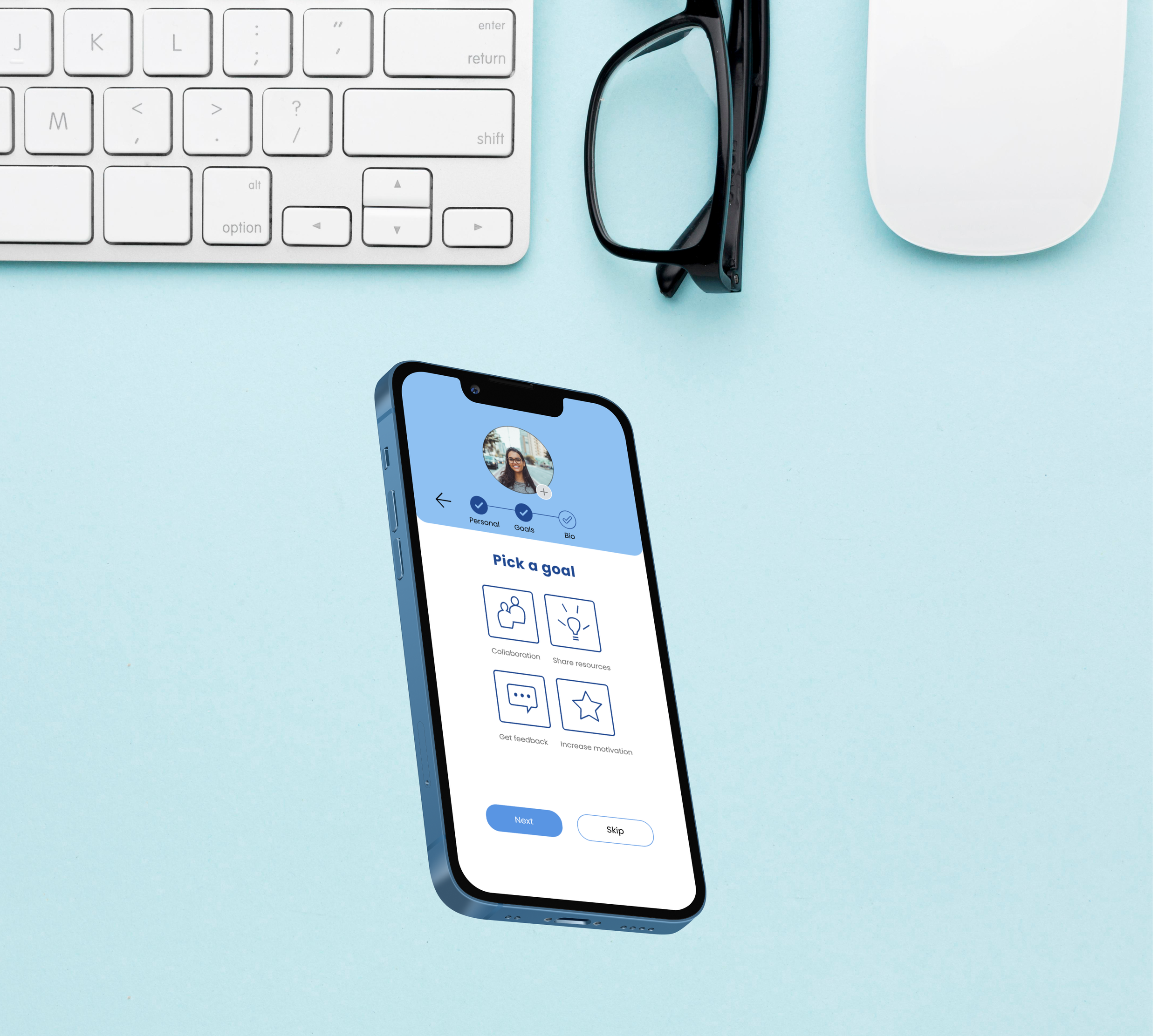
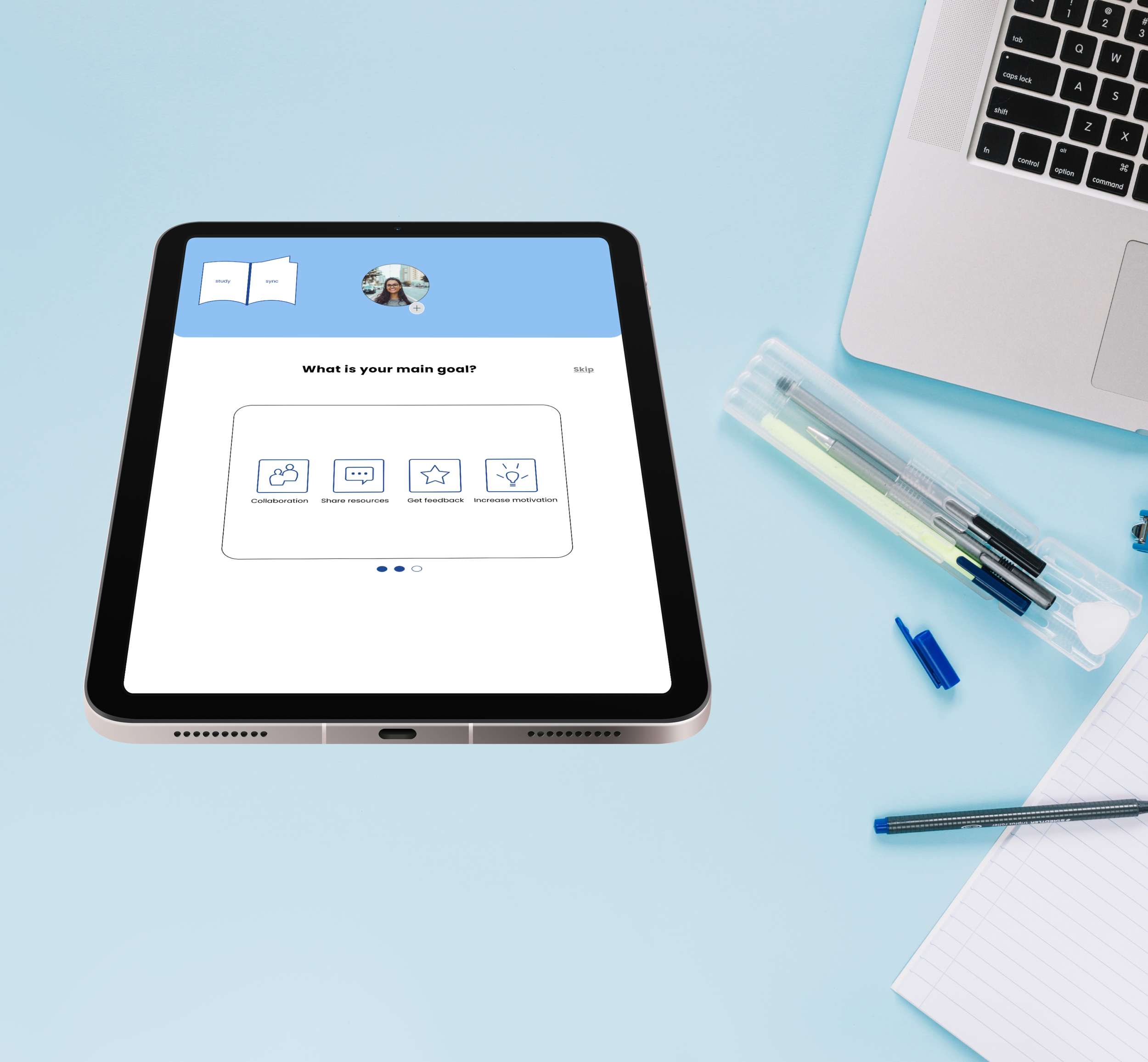
Objective: Peer-to-peer learning can increase motivation and engagement with a subject. This responsive web app is the medium to allow students to connect with others in their field and discuss topics, share insights, receive peer feedback on assignments and find others willing to collaborate on projects.
Duration: 1 month
Tools and Methods: Figma, Wireframes, Prototypes
User Stories
User Stories


As a new user, I want to create a profile so other students can find me.
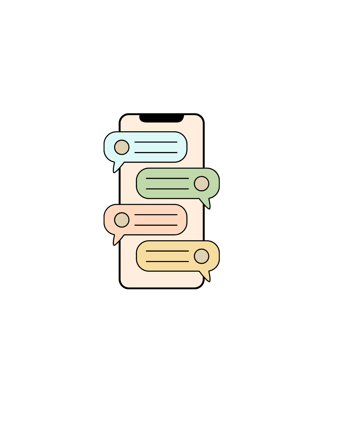
As a frequent user, I want to be able to view and share articles, videos, images, and other files, and write posts for other students to read, so that we can share knowledge.
As a frequent user, I want to be able to message other students, so that we can problem-solve together.
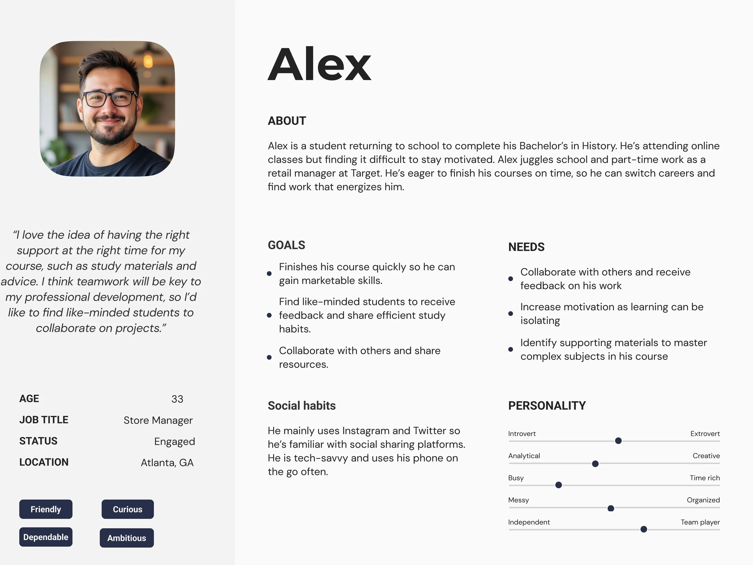
User Persona
Alex is returning to school to finish his Bachelor’s in History while juggling full-time work as a retail manager at Target and part-time school. He is currently engaged and is eager to complete his studies so he can increase his job prospects to take care of a family. He understands many jobs require at minimum a college education.
Alex’s top goals for an app include the following:
Finish his course quickly so he can gain marketable skills
Locate like-minded students who are serious about their studies to share and give feedback and resources.
Collaborate with others and share efficient study habits.
He needs a space where he can collaborate, increase his motivation to learn and to share resources.
Mood Board
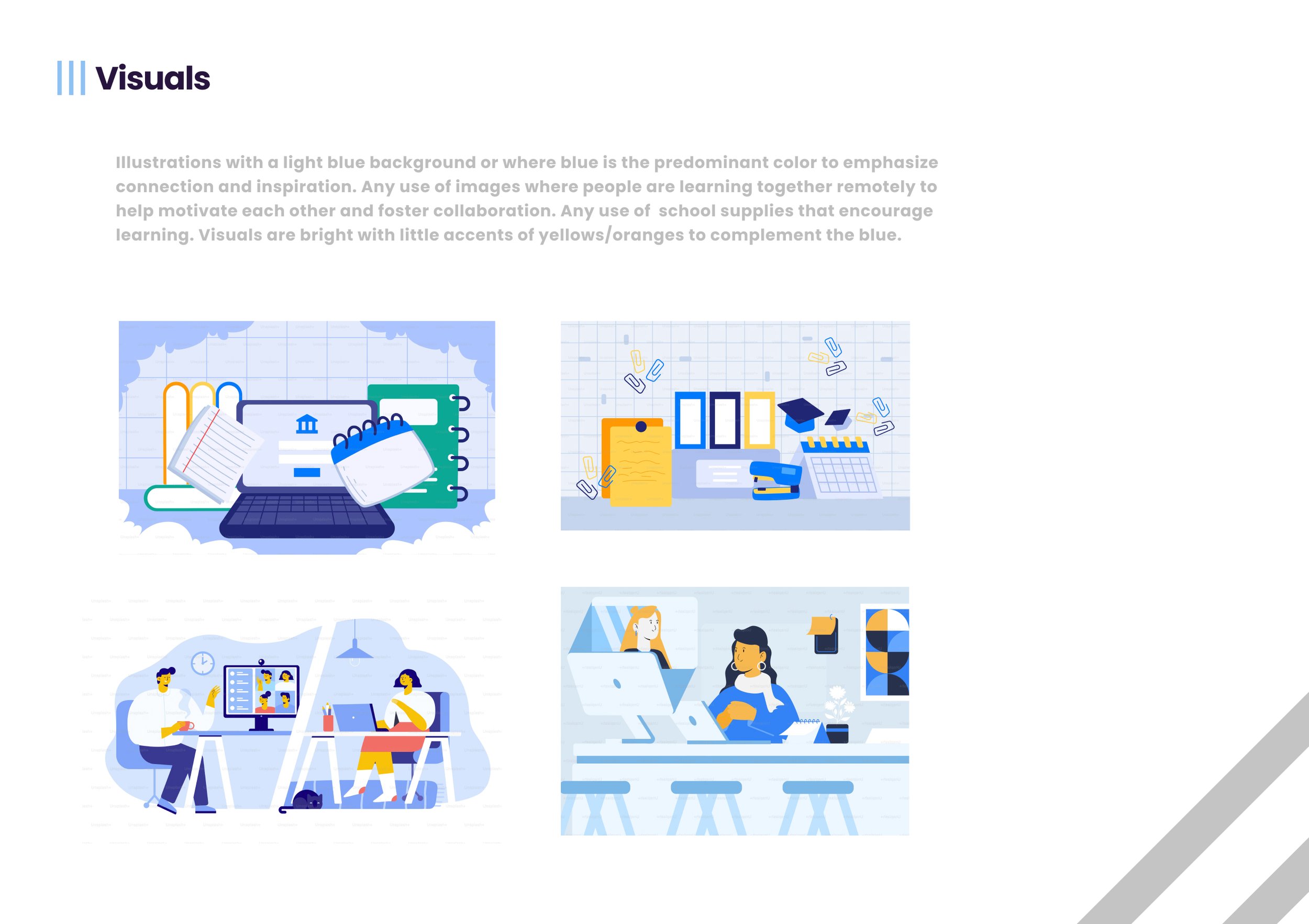
I created two mood boards and opted for this design where I wanted to convey connection, inspiration and support among learners. With these descriptive words, I wanted to convey bright and motivational colors for my users when it comes to learning.
If people are feeling isolated when learning, it can make your motivation levels wane, so I wanted to introduce cheerful colors, illustrations and animations to make virtual learning fun.
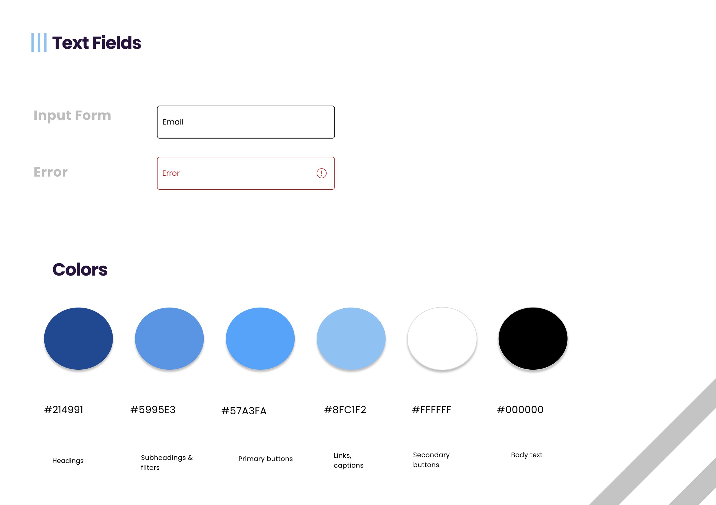
While I liked the overall colors and visual illustrations, I wanted to ensure my app complied with web accessibility standards so I opted for a monochromatic blue instead. This was an exciting part of the project though as it fed my appetite to apply more creative direction with my app.

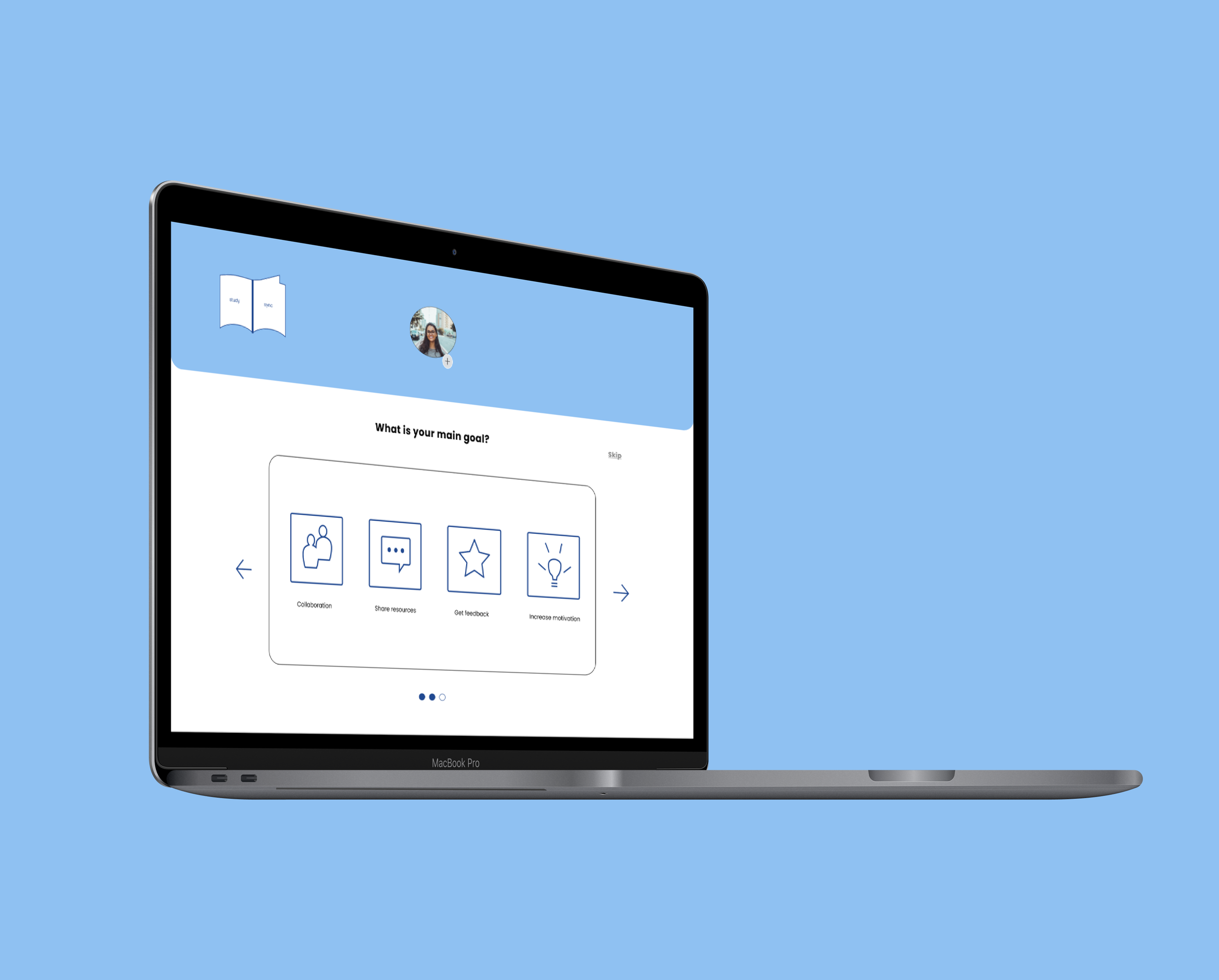
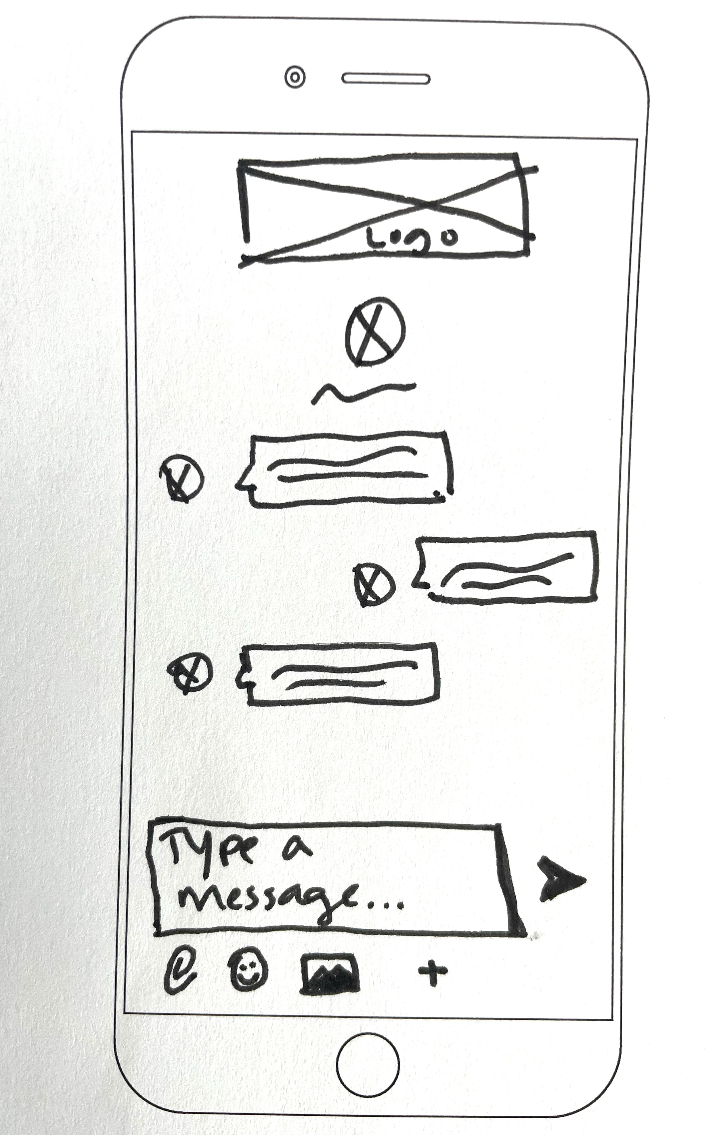
Low-fid wireframes
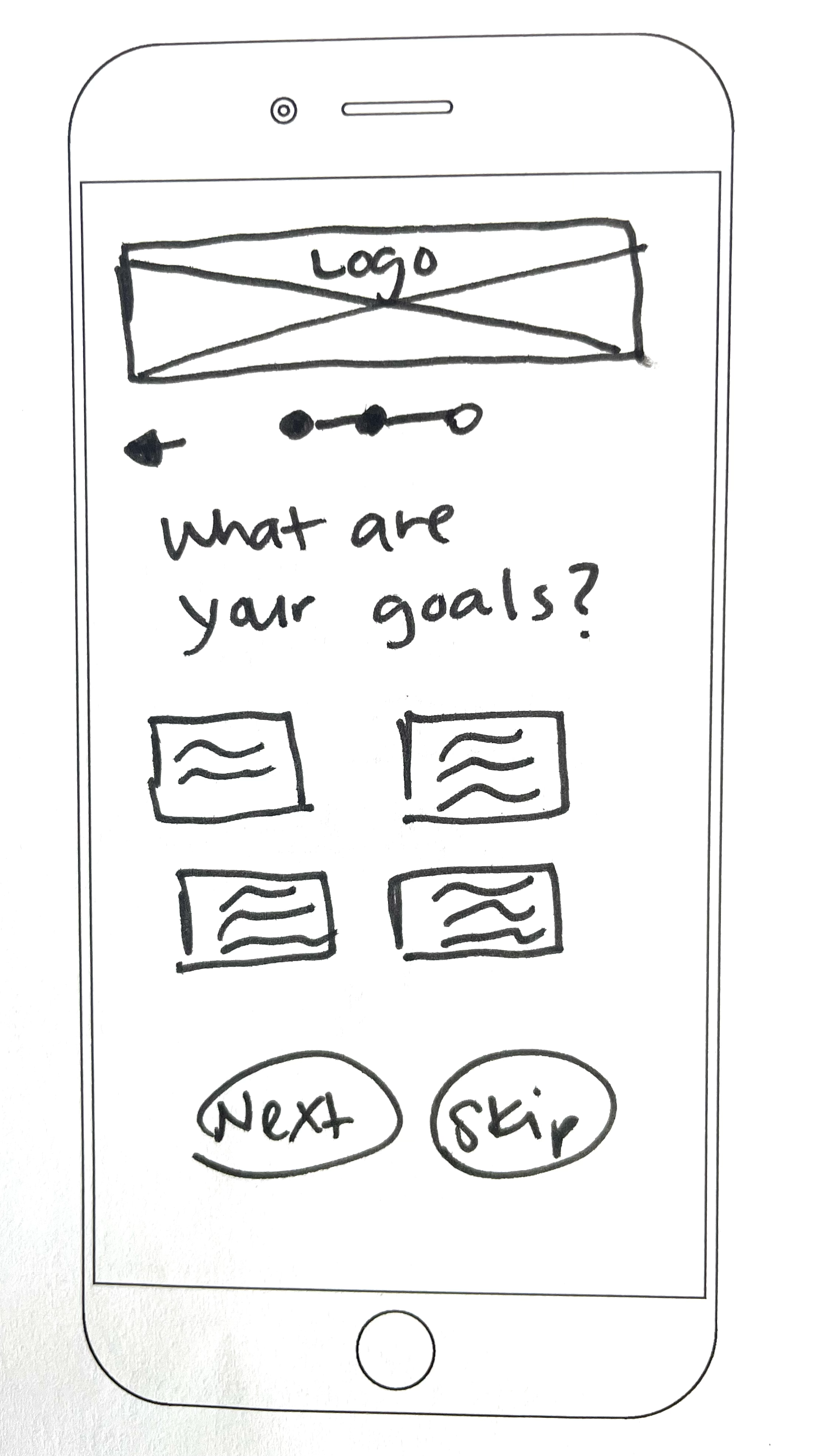
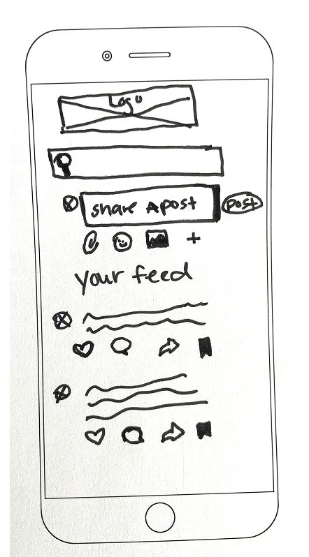
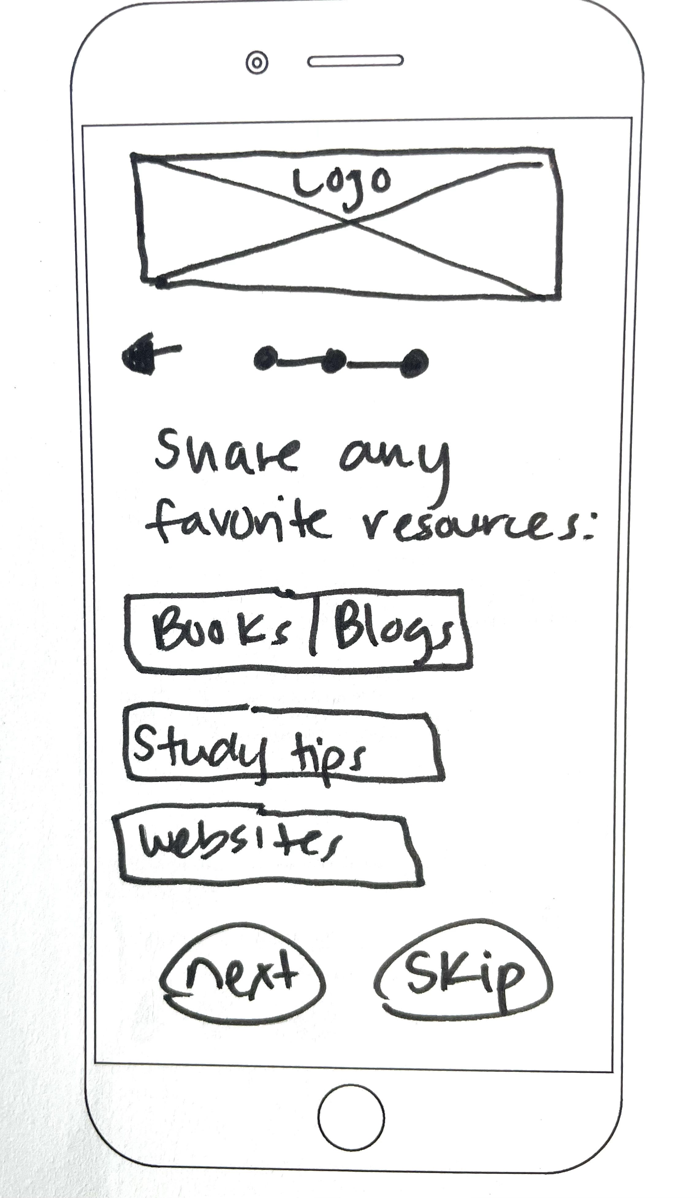
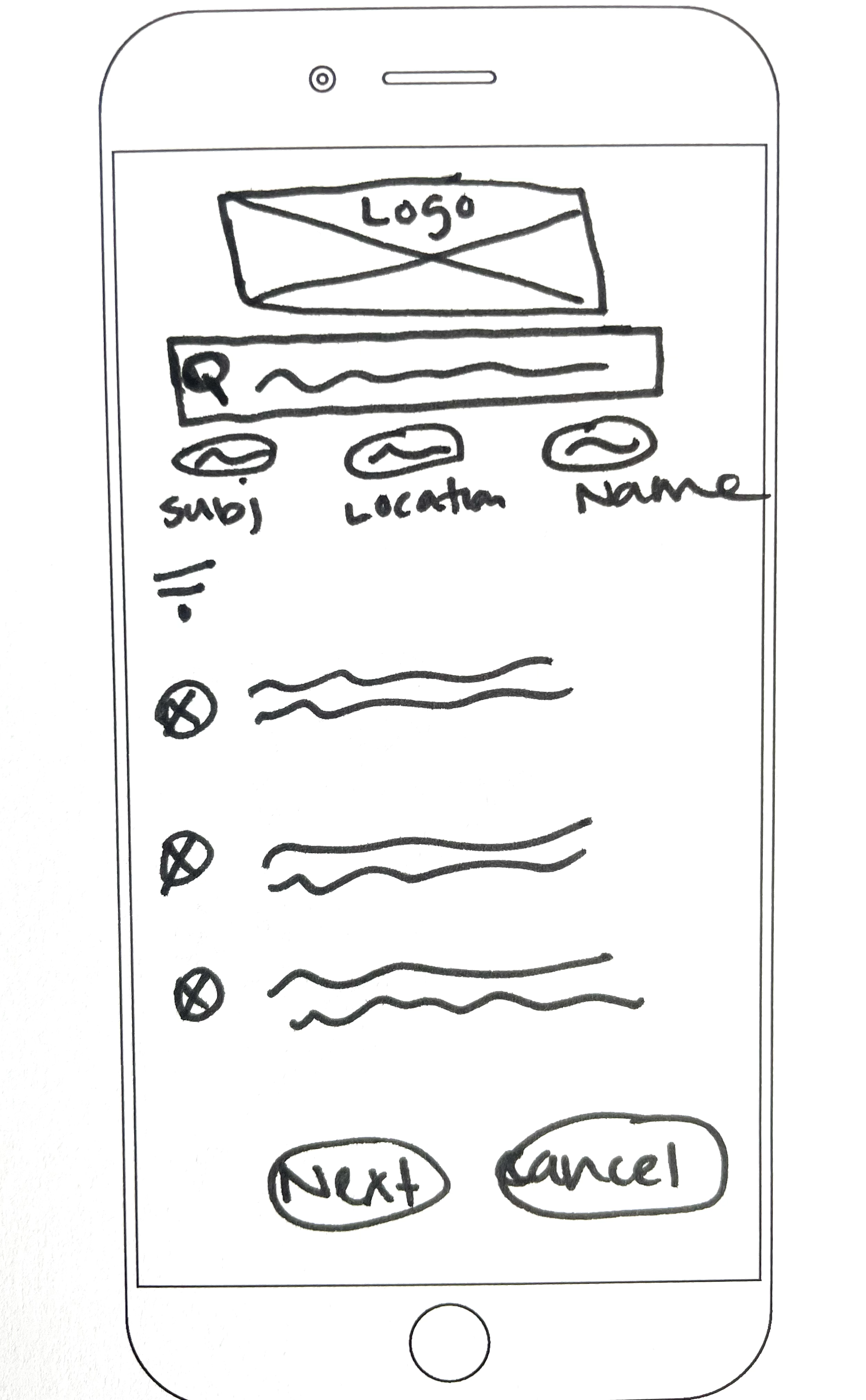
Armed with a pencil and paper and with my user stories in mind, I sketched out some low-fid wireframes highlighting entry points needed to accomplish the user goals reflected in our user flows and user stories. I had to remember to keep the user flows in mind so as not to introduce multiple stages for users.
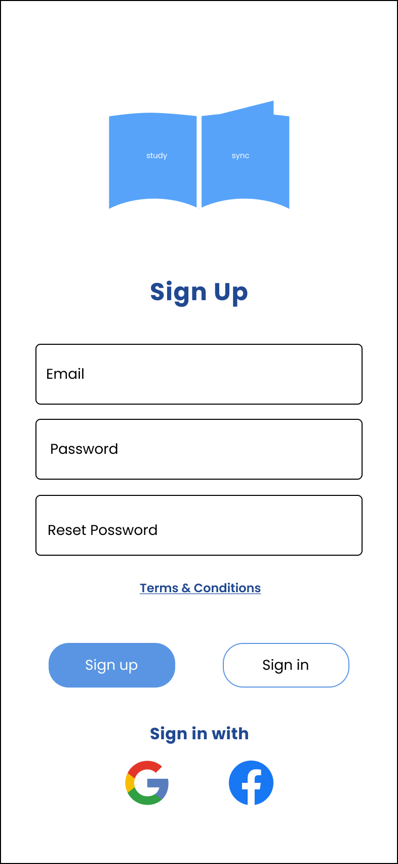
1) Account creation and sign in
2) Share articles to your feed, comment and like other posts, exchange feedback
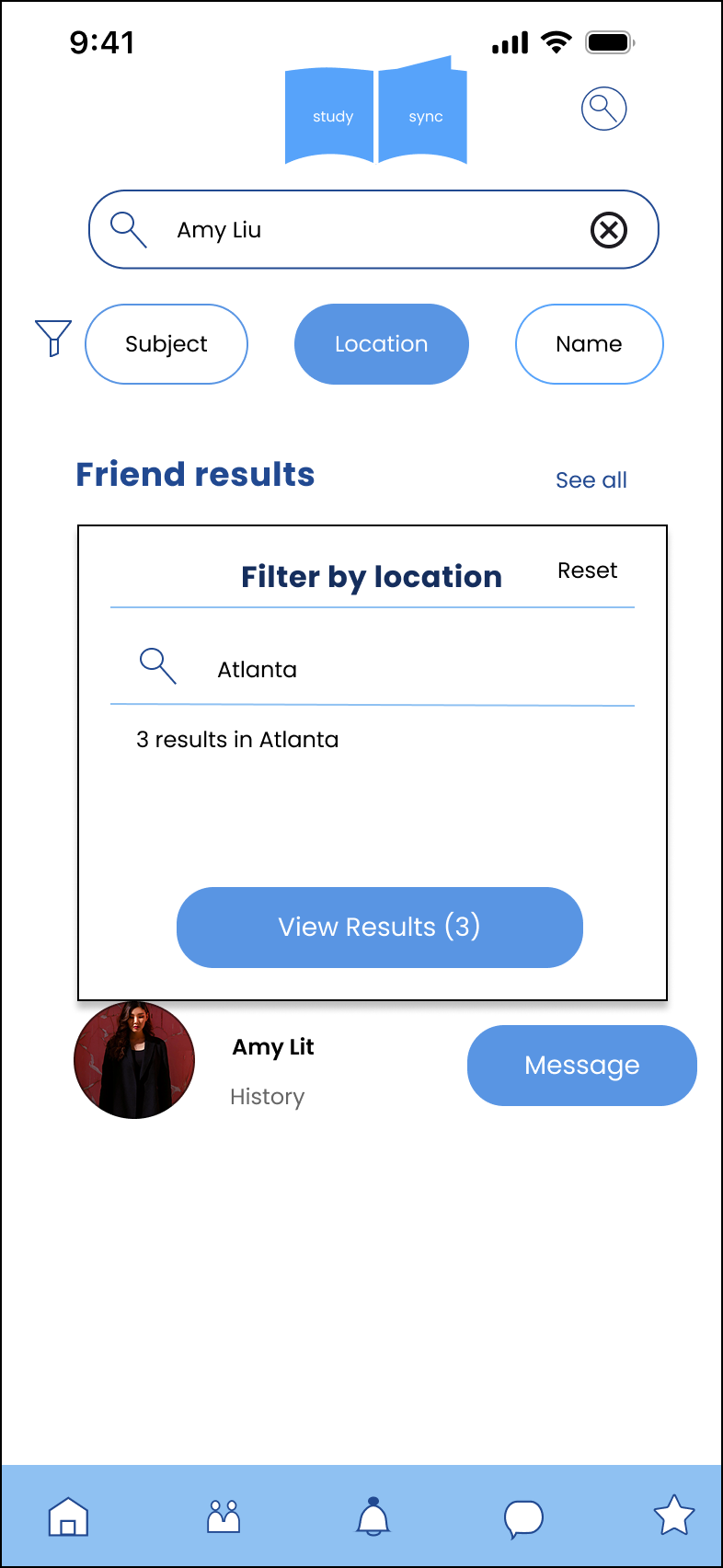
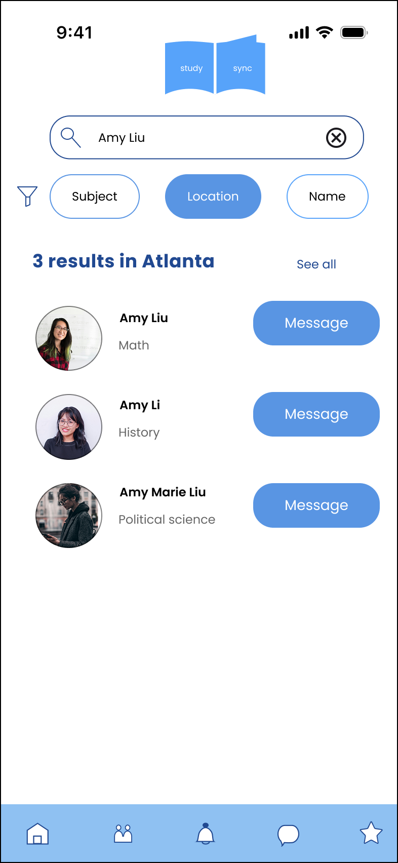
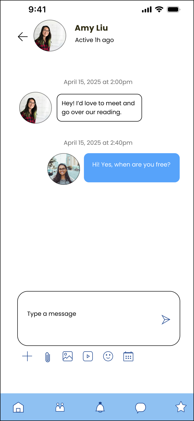
3) Searching and direct messaging friends
As a new user, I want to create a profile so other students can find me.
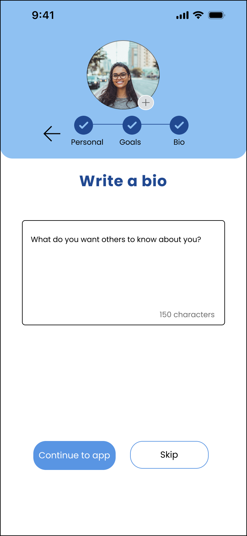
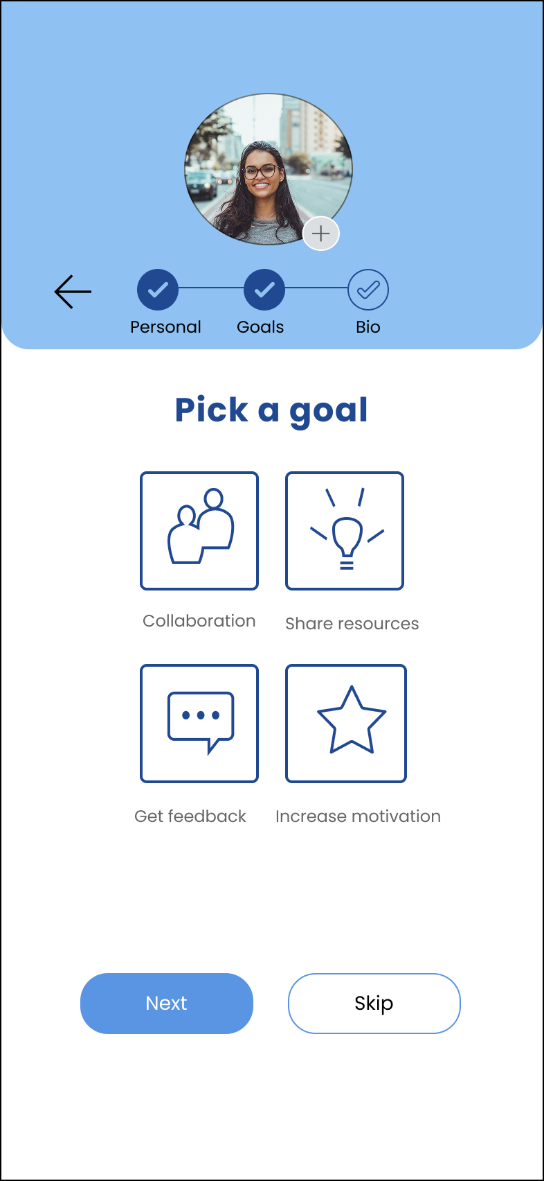
Feature requirements: Personal profile including image, subject, location, favorite resources/books, Sign In
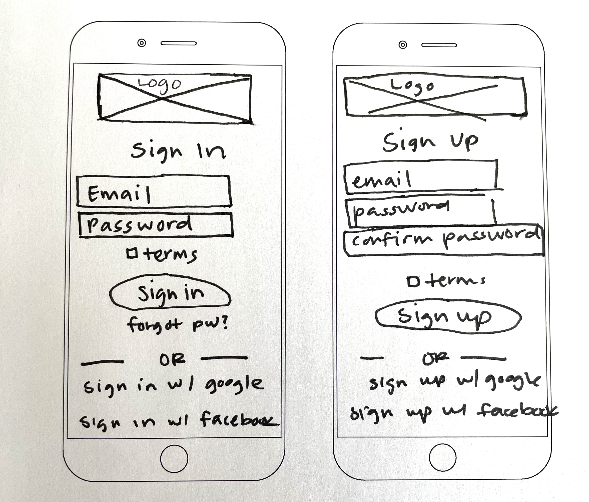

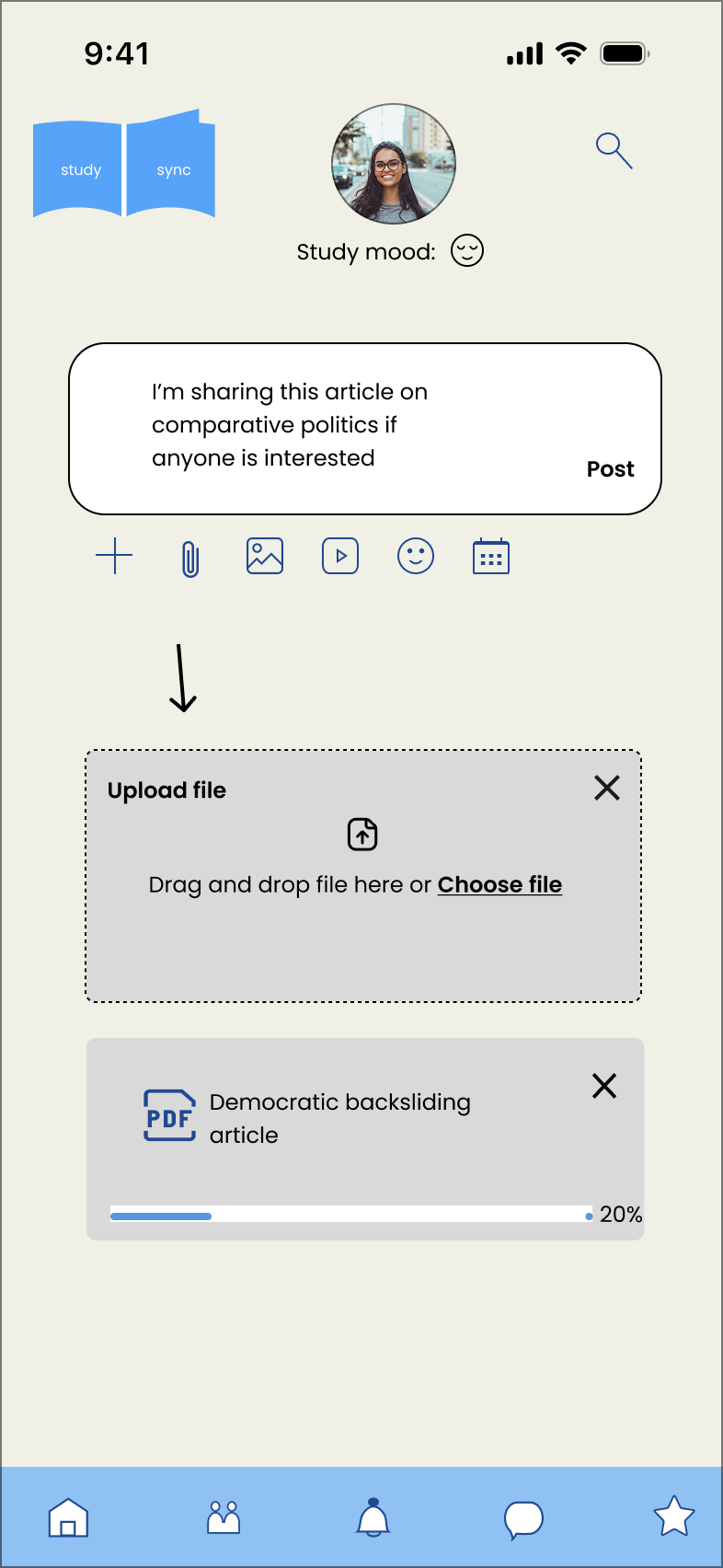
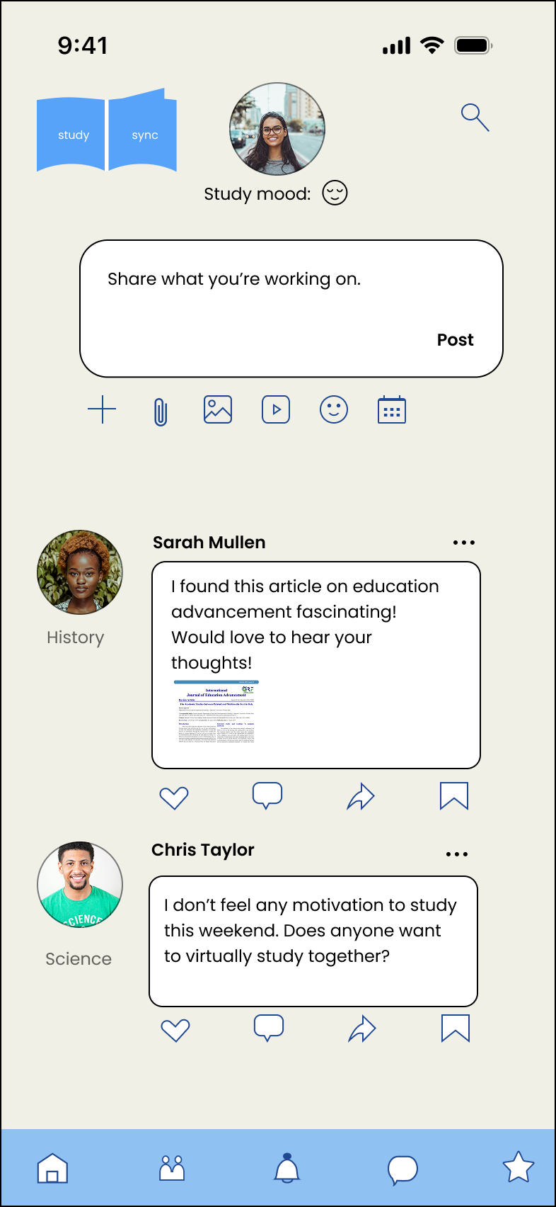
As a frequent user, I want to be able to view and share articles, videos, images, and other files, and write posts for other students to read, so that we can share knowledge.
Feature requirements: News/updates reel, social sharing, notifications

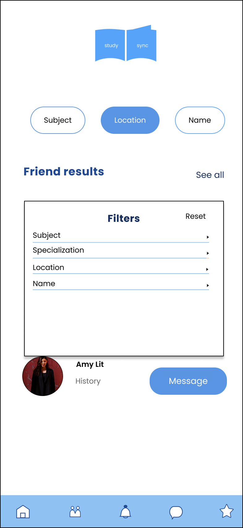
As a frequent user, I want to be able to message other students, so that we can problem-solve together.
Feature requirements: Search and filter friends, direct message, notifications


Mid-Fid Wireframes
After getting my low-fid wireframes and testing it out informally with friends to make sure the flow made sense, I transitioned my sketches to mid-fidelity wireframes in Figma. This stage enabled me to incorporate key UI elements that facilitate social connections for users, including social sharing features, direct messaging and navigation buttons. I originally didn’t intend for a bio section in my initial sketches, but I decided on including a bio during profile set-up as this lets users provide a quick introduction for their social network and lower barriers to reaching out to people.
As a new user, I want to create a profile so other students can find me.
Feature requirements: Personal profile including image, subject, location, favorite resources/books, Sign In


As a frequent user, I want to be able to view and share articles, videos, images, and other files, and write posts for other students to read, so that we can share knowledge.
Feature requirements: News/updates reel, social sharing, notifications

As a frequent user, I want to be able to message other students, so that we can problem-solve together.
Feature requirements: Search and filter friends, direct message, notifications

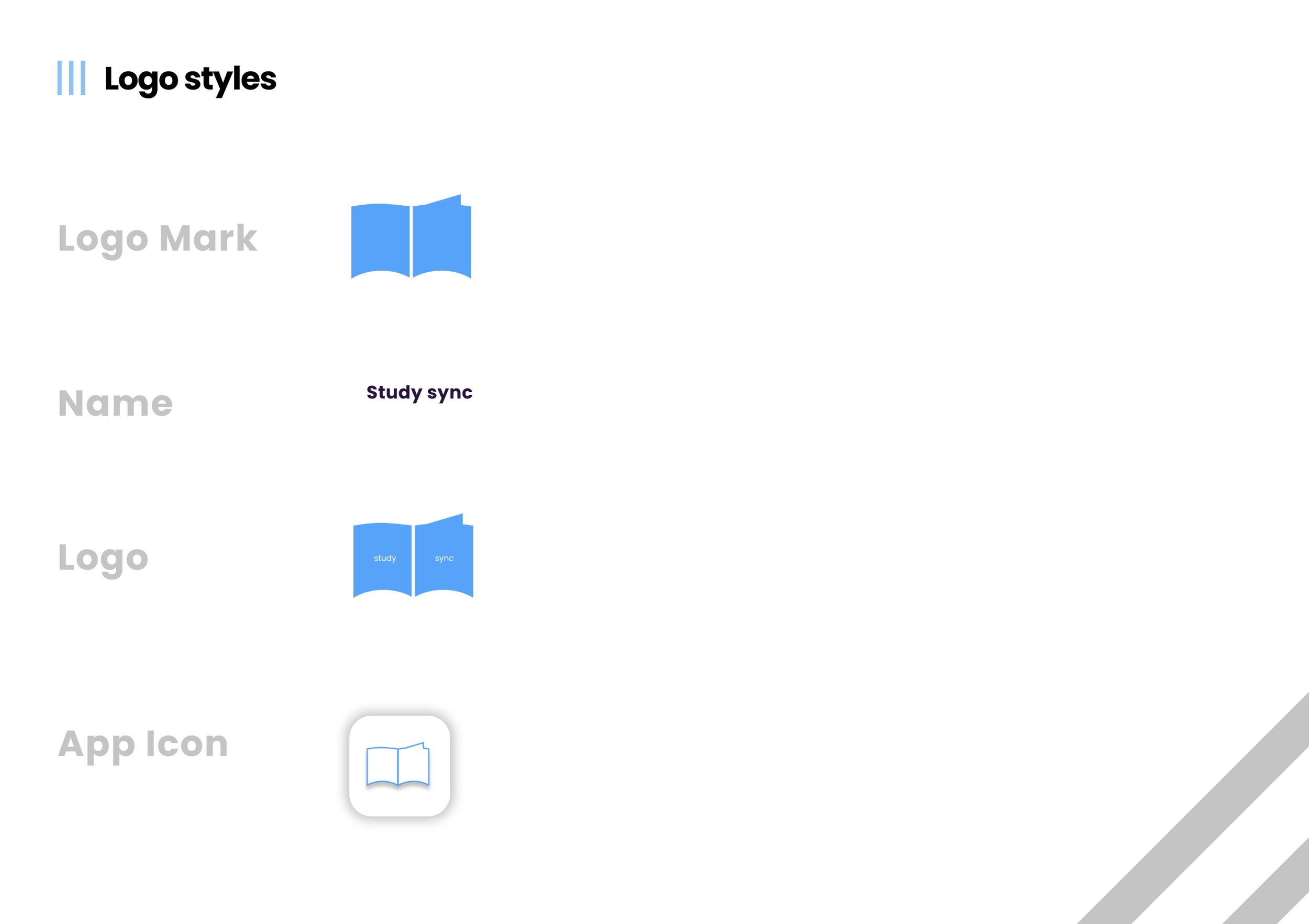
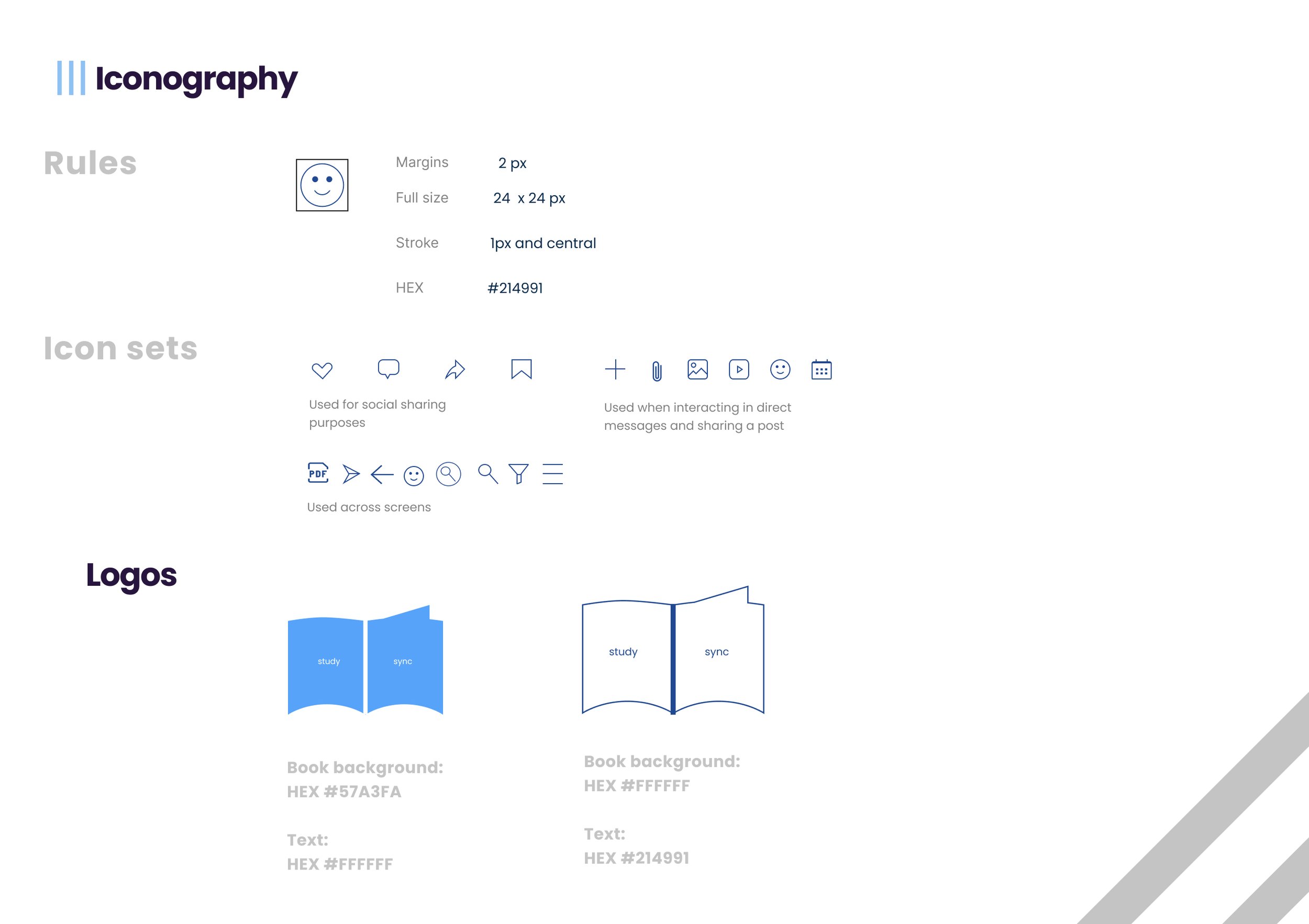
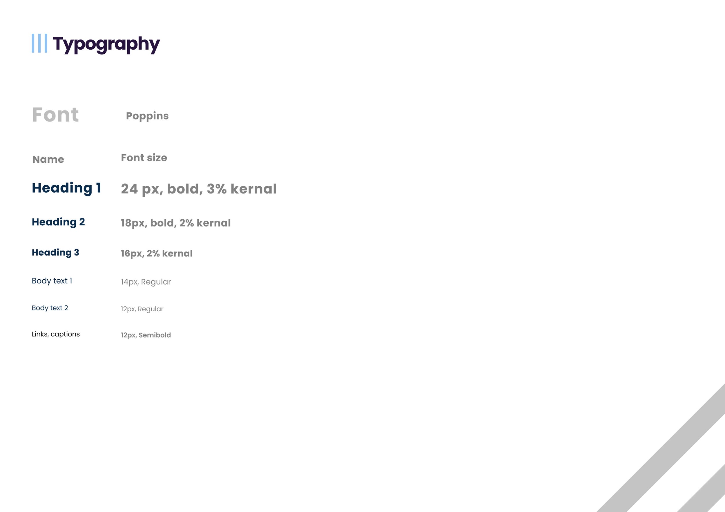
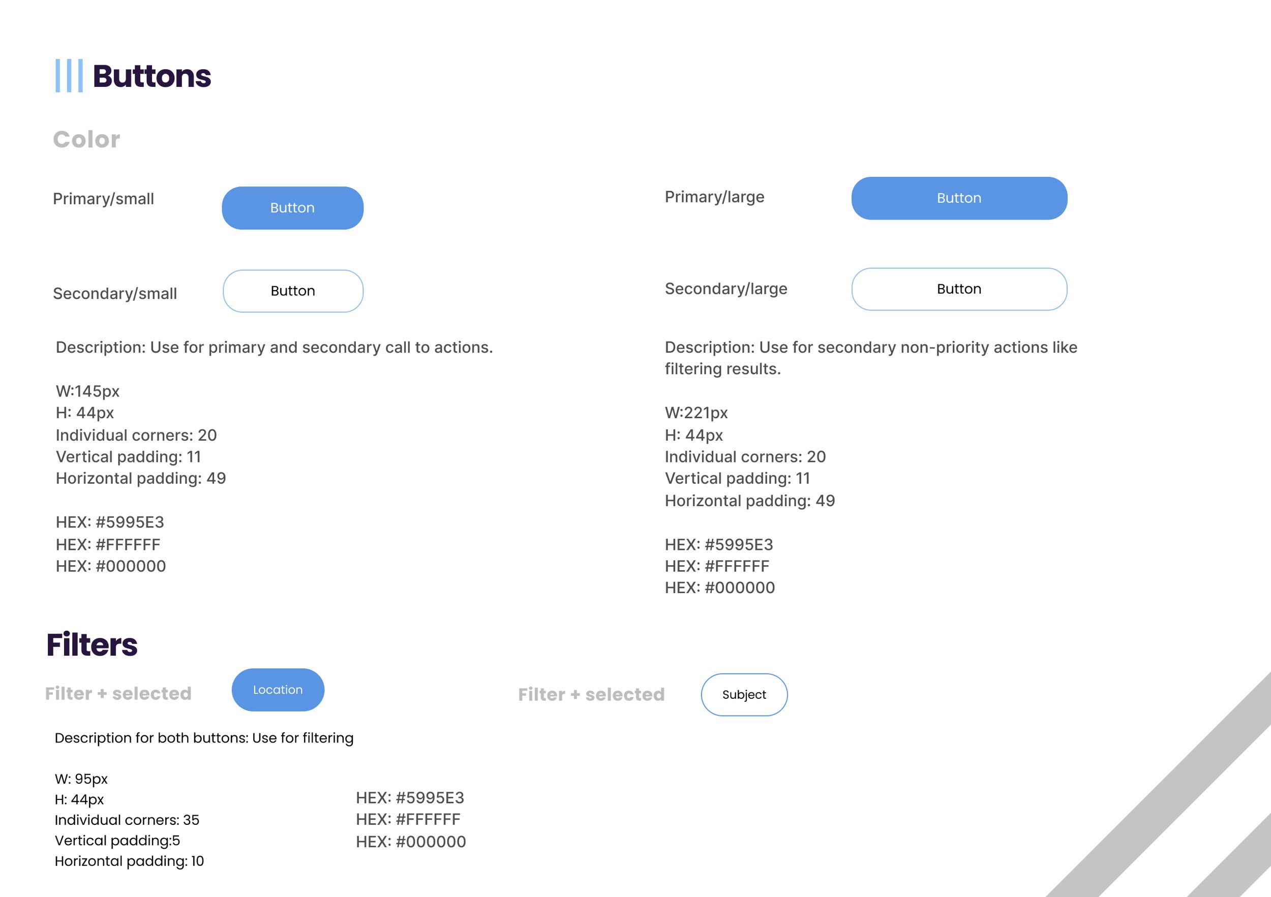
Style Guide
I created a brand style guide highlighting design parameters around logos, icons, typography, colors, text inputs, buttons and visual illustrations for a smoother handoff to developers. Additionally, I created a central drive hosting handoff deliverables, including assets, mockups, images and UI elements (buttons, icons, logos).
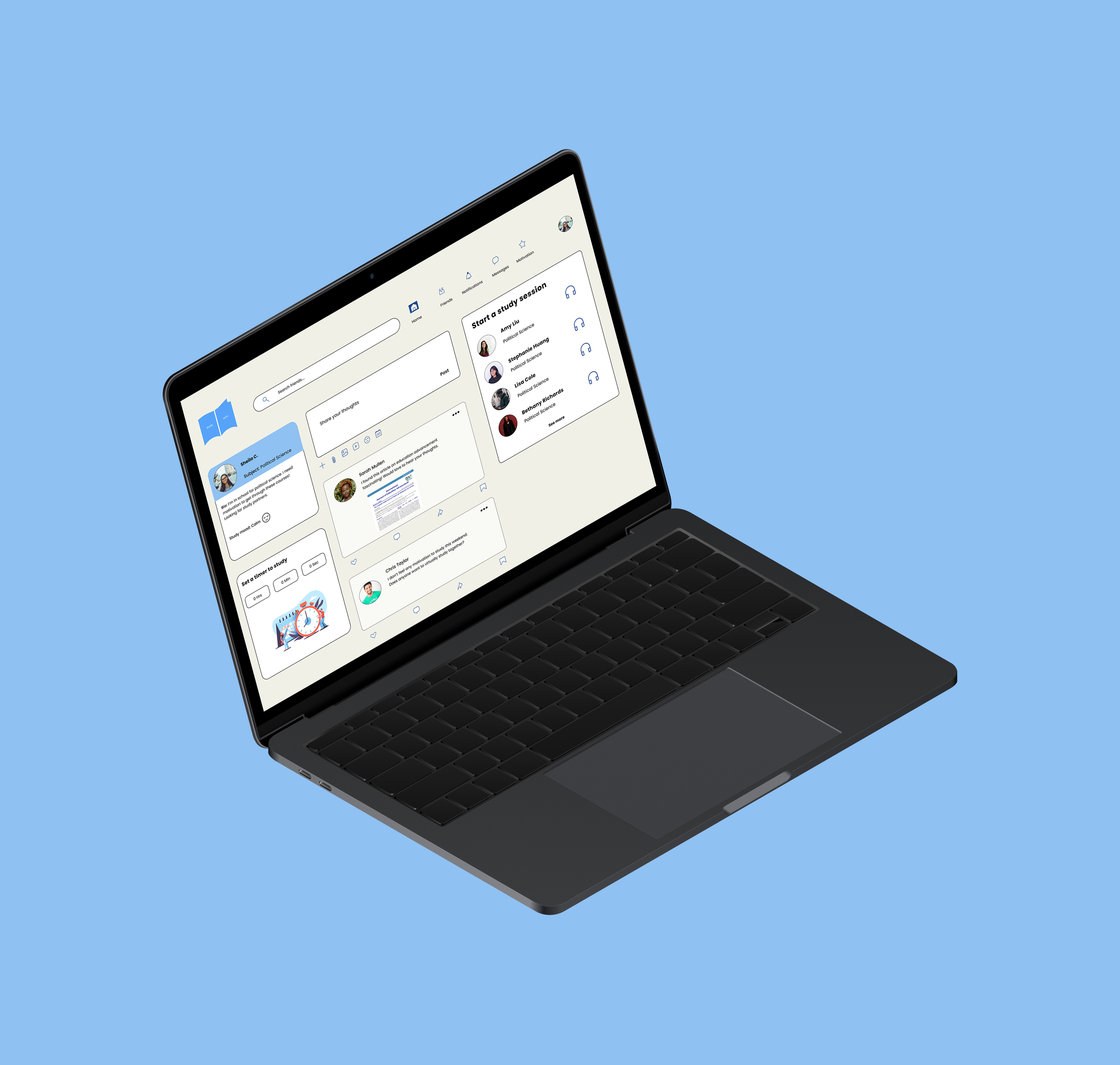
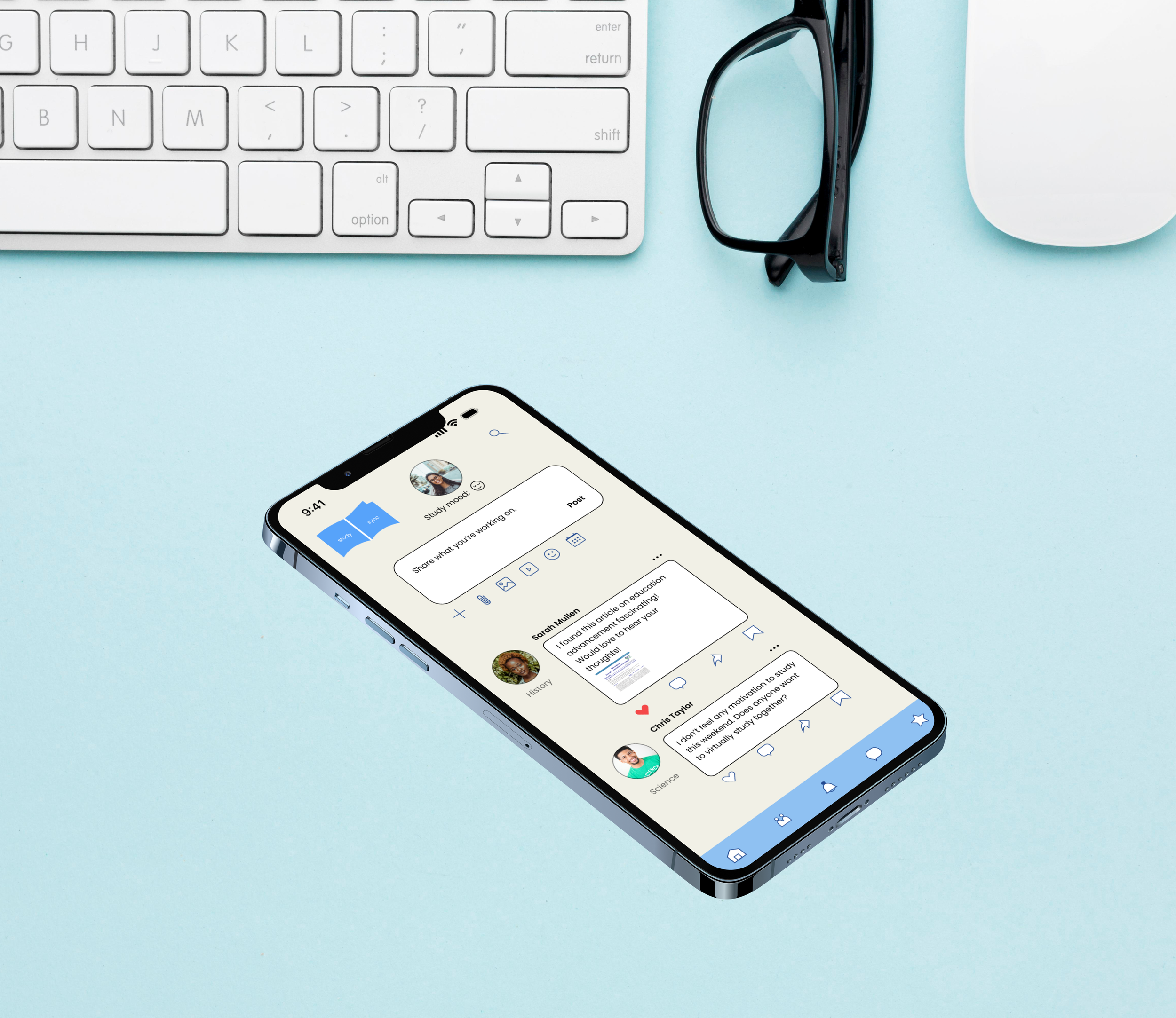
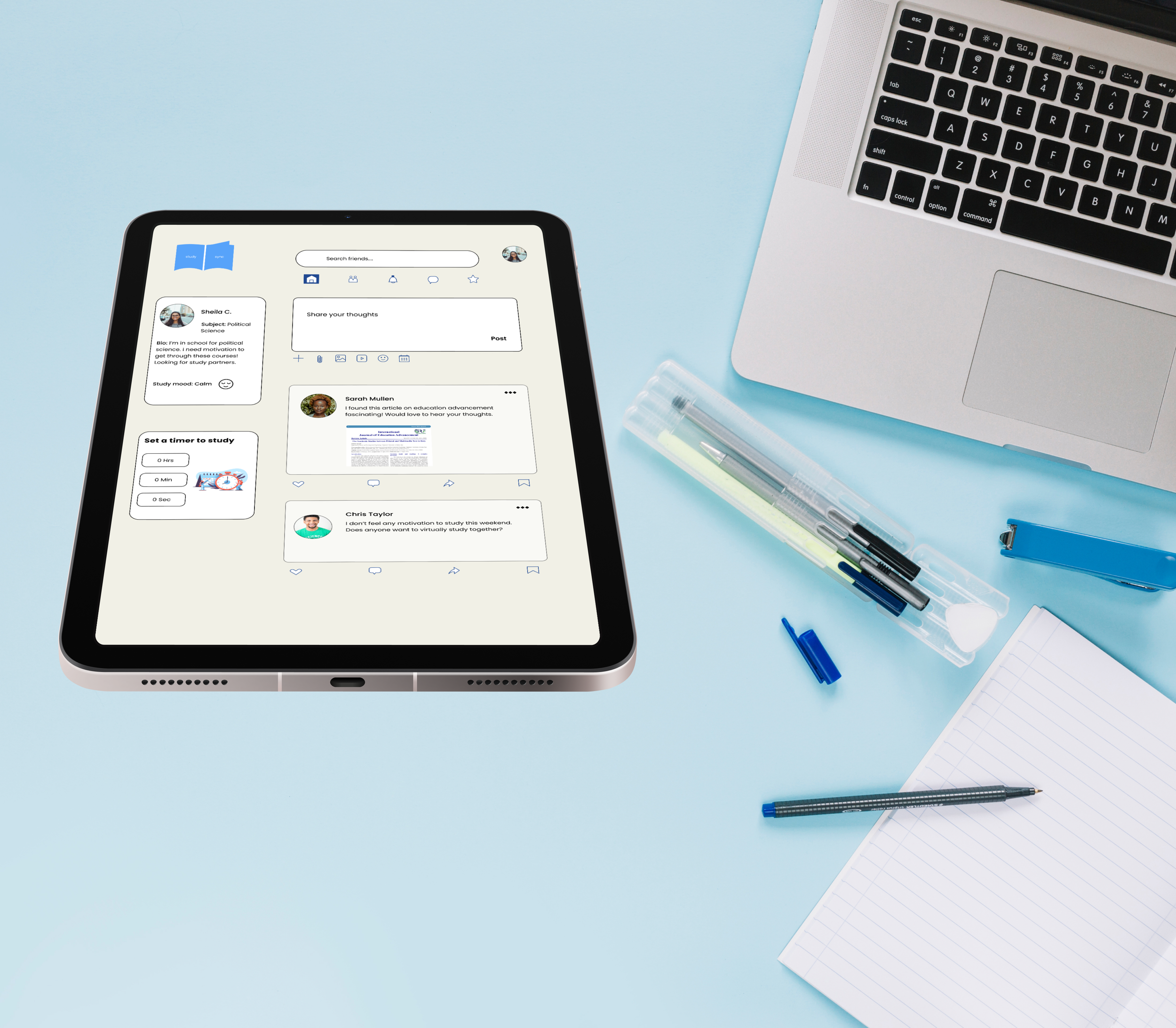
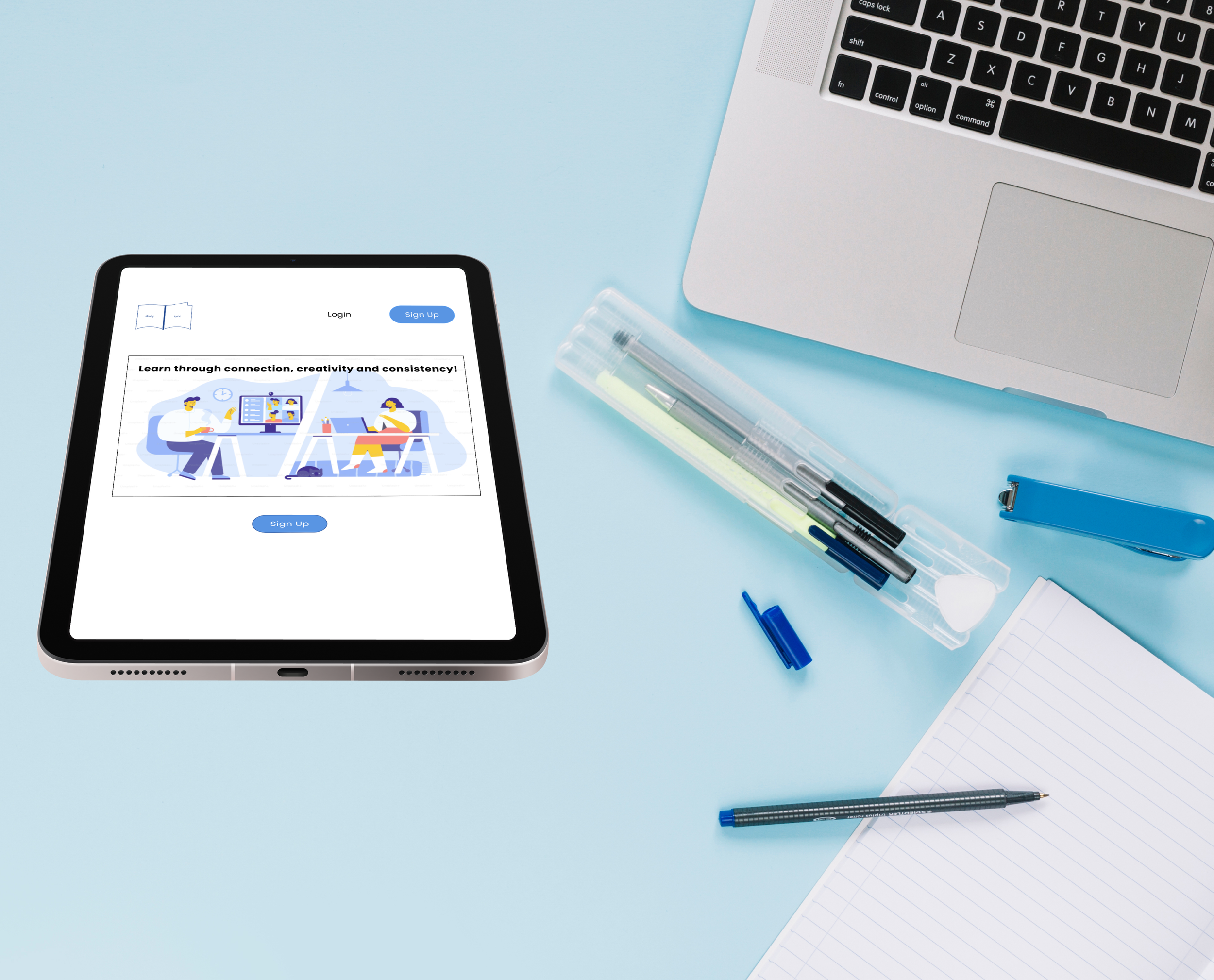
Mockups
Click through my prototype below
Challenges and Reflections
The challenging part of my project was the visual and color elements of the app. I kept going back and forth between whether to use stock images or illustrations and decided on the latter because they communicate a balance of fun and social connection especially with blue colors. My color palette changed mid-way because I wanted to ensure they complied with web accessibility standards. I learned to often refer back to the user flows and personas to ensure the experience is centered around true needs and to reduce any friction points.
I plan on improving in my next iteration a section where students can write encouraging notes to each other through a virtual bulletin board.